Customer satisfaction, employee engagement, and product quality – all can be measured using surveys. In this article, we discuss 8 ways a business professional can improve their survey techniques to get more business insights with less efforts.
Here are the topics that we’ll discuss:
- What are the advantages and disadvantages of the surveys?
- What are the alternatives?
- Why bad business practices look great through the survey prism
- The problem of multiple choice questions and how to fix it
- Survey checklist with recommended best practices
- Some advice on how to present survey data on a strategy scorecard
A Quick Overview of the Surveys: Advantages and Disadvantages
Surveys are a great business tool. Many organizations use them to get some feedback from their customers.
Surveys help to cut costs of market analysis. Instead of thinking about sophisticated IT to track customer behaviour, an organization can simply ask their questions directly to the end users of their product.
The opposite side of the coin is that:
- The results of the surveys are subjective
- The data obtained is affected by observation bias (the way we formulate the question predetermines the way people will answer it)
- The answers to the pre-defined questions ignore important contextual nuances
- The free-form answers are hard to quantify
Probably, the most dangerous drawback of the surveys is that their results can be easily manipulated. I’m not talking about an angry client who decided to give a “bad” rating to the customer service. I’m talking about the management team that unconsciously manipulates a survey on the early design stage by using multiple choice questions. Below, we will talk in detail about this problem and how to avoid it.
Observation is an Alternative to a Survey
Do we have an alternative to surveys? I discussed this in the 10-Step KPI System book; the alternative is observation.
Instead of interacting with the customers by asking questions, we could do what astrophysicists do with stars – observe without direct contact with the subject of observation. We started talking about this in the complexity metrics article.
Should we stop using surveys at all? No way! We need to understand the limitations of this tool and learn to get the best possible results from using it.
Why Bad Business Practices Sometimes Look Great Through the Survey Prism
On a late summer evening, you land at Charles de Gaulle Airport, France, and find out that your bank cards have been blocked. After talking to a bank representative, you know that there was an IT error on their side, and that you won’t have any access to money on your bank account for at least one week until new cards can be mailed to you. They know your situation, and they care a lot, but instead of sending new cards urgently via FedEx directly to the hotel, they simply say “sorry” and promise to fix it as soon as possible. This is a bad business practice.
Some days later, you get a call from the customer loyalty service of the bank. They want to know your opinion about the service provided to you recently. You are willing to let them know everything you think about their bank and explain how hard it was to survive without cards, but the format of the call implies that you answer the survey questions.
Let’s have a look at those questions:
| Survey question | Answer |
|---|---|
| “Was the call answered fast?” | Could be better, but yes, it was. |
| “How professional was the person who handled the call?” |
|
| “Would you recommend our bank to others?” | The way bank managed the situation was not acceptable, but there are, of course, some benefits of being their client.
Should I answer here “Never again” or try to be more realistic and say, “Probably yes…?!” |
You are willing to add some more comments, but on the other end of the line, all fields of the survey are now completed, and you hear:
- “Thank you for your opinion. It is VERY important for us. Good bye.”
How will the results of the survey look on the bank’s dashboard? Depending on your answer to question 3, the satisfaction indicator will be somewhere in the area of “excellent” or “good!”
The Problem of Multiple Choice Questions and How to Fix It
There is one common thing about the questions asked – they are all easy to quantify.
Actually, any multiple-choice question is already quantified. Let’s call them pre-quantified.
It is easy to calculate the percentage of clients who have chosen certain options, and then use an average of the three answers to get a “Customer Satisfaction Index.” Magic happens, and managers have some data to use for the charts for the annual performance report.
Unfortunately, such an approach doesn’t give any clue to what customers liked, and what not, or what their challenges are.
Customers don’t think about a company within three perspectives. They don’t think separately about “Response time, minutes” or “Customer representative proficiency.” They think about their problem and how easy it was to solve it.
Use Open-Ended Questions to Get More Insights
With the described approach to the surveys, management will have a slight idea about the problem that the customer faced. A quick fix would be to add an open-ended question that requires a free-form answer.
Here is a real example. The open-ended question of one of our surveys was:
What is your key challenge with the Balanced Scorecard?
And here were the answers:
- “I’m just looking how to get started”
- “I need to understand how it will work for IT”
- “I want to know how to transfer top level strategy to low levels”
- “Getting buy-in”
- “Internal perspective planning”
I think these answers are valuable for R&D and Marketing. For example, we can:
- Group them into the categories,
- Count the number of answers in each category,
- Compare answers to the client profiles, and
- Come up with some sort of strategy that will help to better satisfy the client’s needs.
Easy, right? Why don’t companies do this? Two reasons:
- The open-ended questions are known factors of higher abandonment rate of a survey (so be careful with them);
- Free-form answers are hard to quantify, as they need to be processed manually.
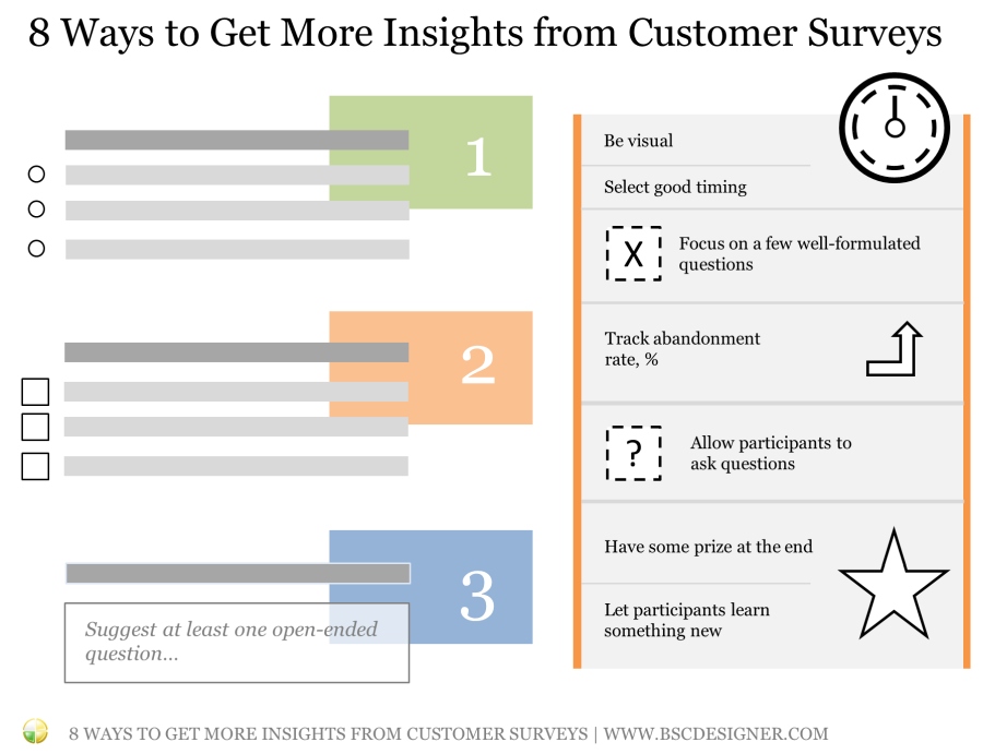
A Checklist for Better Surveys
Using open-ended questions is a good starting point, but it is important to look at the problem from various perspectives. Here is a list of 8 ideas that will help you to design better surveys. Feel free to add additional thoughts in the comments.
1. Focus on a few well-formulated questions
Twitter with its 140 characters is popular for a reason. Depending on the context of the survey, the best number of questions is around 3-5.
2. Suggest at least one open-ended question
The answers to such questions are hard to quantify, but at the same time, they are the most valuable. Teach your team to read between the lines and allow customers to go into detail when it makes sense.
3. Be visual
Look at Typeform for some ideas. At least some of the participants of your survey will appreciate good visuals and professional design. You will confirm it by observing a lower abandonment rate.
4. Select good timing
Asking to fill in a customer satisfaction form when a guest checks out from the hotel and needs to catch a flight is not the best idea.
Find the best time to do surveys.
For example, in the software business, users are more willing to share their thoughts about the product right after their current problem was solved.
5. Let participants learn something new
Don’t just ask questions, engage with the participants of the survey.
Avoid a boring design; avoid boring questions; try to teach something, not just ask.
In one of the surveys, we asked participants to select the KPI practices that they use – later, we found out that the survey questions worked like an action plan for many of the potential users.
6. Allow participants to ask questions
You need to be creative to get the questions from the clients. You cannot simply add a field: “You can ask your questions now.” – it doesn´t work.
Try asking an open-ended question that will make customers think in the right direction.
We did this by asking clients “What’s your biggest challenge with…?” On the next step, we suggested entering emails to get the answers. Around 23% of the participants shared their challenges and shared their emails to get an answer.
That was useful to learn more about their needs, and, in most cases, we could answer by simply sending a link to the relevant best practice article.
7. Have some prize at the end
It should not be something expensive. You are not buying a client’s time (it is worth much more). You goal is to give proof that client’s opinions matter.
Give some bonus points to their loyalty card, promise a good discount for a front-end product.
In one survey, we gave a 75% discount. The front-end product generated almost no profit for us, but the value of new hot leads and the information obtained was high. “Answer the questions to see the results” is also a good motivation to get to the end. Combine ideas 7 and 5 – build a quiz-style survey.
8. Track abandonment rate, %
This is a good indicator of the quality of your survey.
People can abandon for many reasons:
- Irrelevant questions,
- Wrong profile of a participant,
- Bad time to ask.
Do a/b tests under different conditions to find out what works better in your case. Don’t forget to track the Participation Rate, %. If you have 20+ questions, many will drop the survey without starting.
Employee Survey vs. Customer Survey
For now, we are talking about conducting customer surveys. What about learning what employees think?
The same principles can be applied.
Normally, with employees, we have a higher level of engagement, so we can expect them to be able to spend a little bit more time responding to survey questions.
The number of questions can be increased a little bit, and we can focus on some more specific topics.
For example at Google, the manager feedback survey contains 11 agree/disagree questions, and 2 open-ended questions. The survey results are anonymized, which is critical for the success of such initiatives. To be able to discuss other challenges, Googlers use additional business tools, such as a “Career conversations worksheet,” a “One Simple Thing” worksheet,” and 1:1 meetings.
Surveys and Strategic Planning
We are doing surveys for a reason. The surveys are supposed to help our team to understand better the needs of the clients and find improvement points. Let’s see how to properly implement surveys into the strategic planning process.
Business Context of a Survey
Surveys work much better when you know why you do them. Sounds like an obvious thing, but many companies do surveys without a particular business purpose, just to get some data for the “vanity” metrics.
How to make surveys focused on the business context? It’s simple! Look at your strategy map and find a goal that this survey helps to achieve!
For example, you can plan to conduct a survey to:
- Improve the product
- Understand better the needs of the customers
- Focus the learning efforts of the team
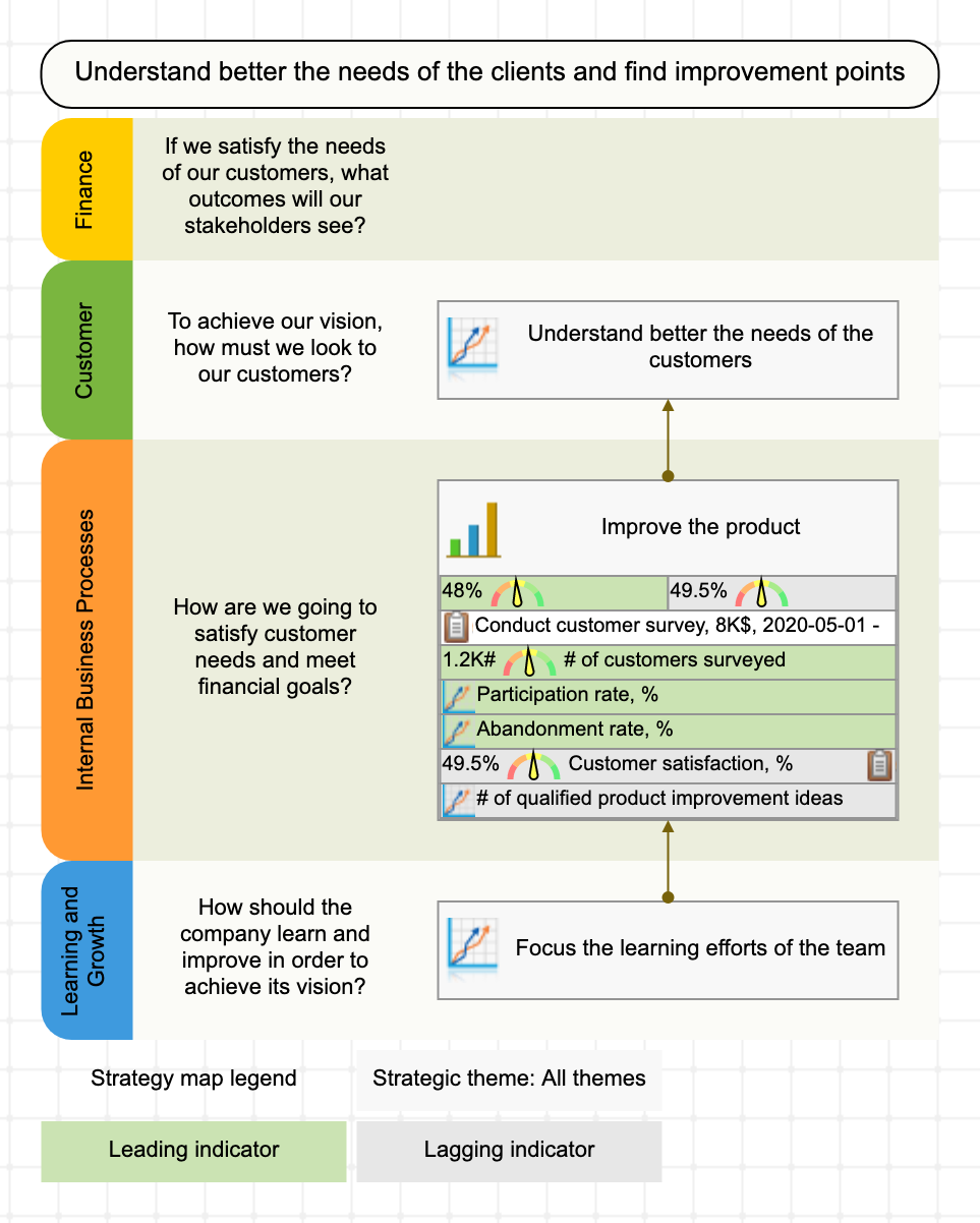
What if there is some goal behind the survey, but it is not on the strategy map? Probably, you are facing one of these cases:
- The strategy map is outdated,
- The goal behind the survey is not relevant for the current strategy, or
- The survey is not relevant on this level of cascading (for example, it is not relevant for the CEO, but it will resonate with a goal from the quality department).
Formulate an Initiative
The survey itself is a small project in the context of the business goal – let’s formulate it in detail. In the strategic planning process, Initiatives are the best tool to do this.
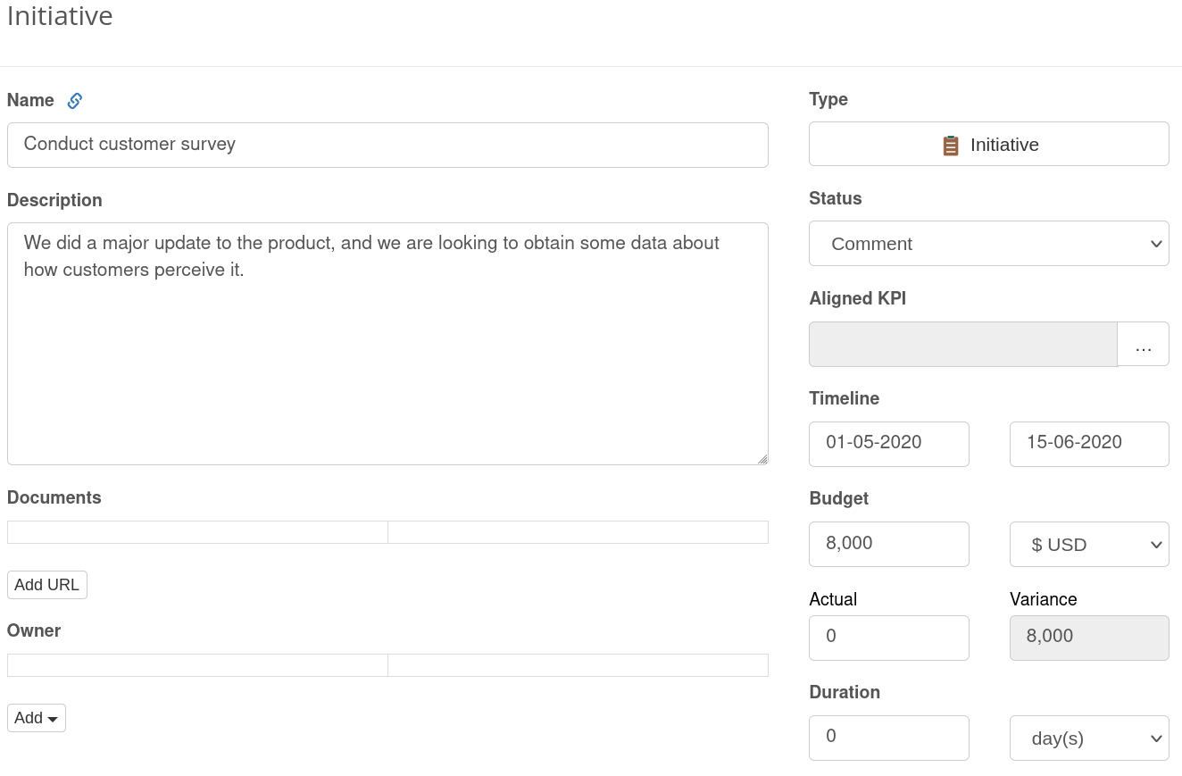
Let’s take the “Improve product” goal as a context for the survey. The new initiative will be aligned with that goal. We can add some general details to the initiative:
-
- Initiative name: Conduct customer survey
- Description: We did a major update to the product, and we are looking to obtain some data about how customers perceive it.
- Budget: $8000
- Timeline: May 1 – May 15
- Additional documents: add here the links to the survey mechanics.
Additionally, we can assign a person responsible.
Indicators for the Survey
It’s a good idea to control the survey process with KPIs as well as the results obtained.
In the context of “Improve product” goal and the “Conduct customer survey” as an initiative, we can define these leading indicators:
- # of customers surveyed
- Participation rate, %
- Abandonment rate, %
The lagging indicators (in the context of selected business goal) can be the results of the survey. We can focus on the obvious findings:
- Customer satisfaction, %
Or go ahead and focus on the actual business impact of the survey by measuring
- # of qualified product improvement ideas
Index Indicators
Customer satisfaction can also be an index indicator, where the value is formed by a combination of indicators taken with different weights.
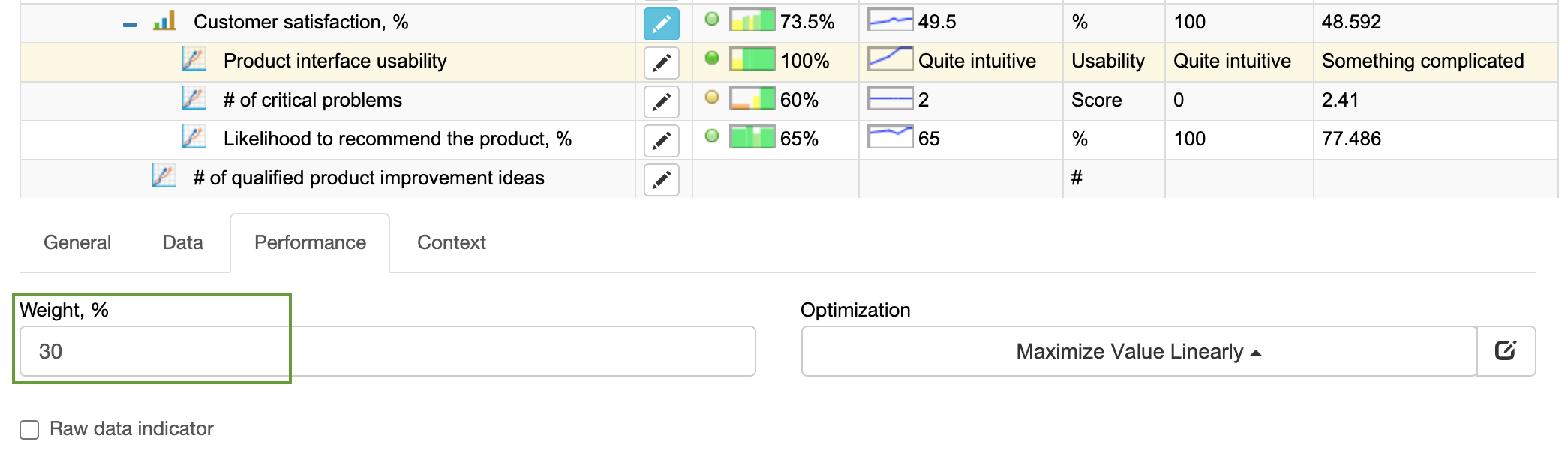
For example, we can build a customer satisfaction index in this way:
- Product interface usability, weight = 30%
- # of critical problems, weight = 40%
- Likelihood to recommend the product, %, weight = 30%
This approach adds value. In this case, we are one step ahead towards understanding the reasons for low/high customer satisfaction.
Qualitative Indicators
With the interface usability indicator, we can illustrate another interesting case. We can ask the participants to estimate usability in a quantitative way, e.g. on the scale from 0 to 100%, where 100% is the best usability experience. While organizations often do this, it’s hard to call such an approach user-friendly.
We can improve by switching to the qualitative scale by giving natural-choice options.
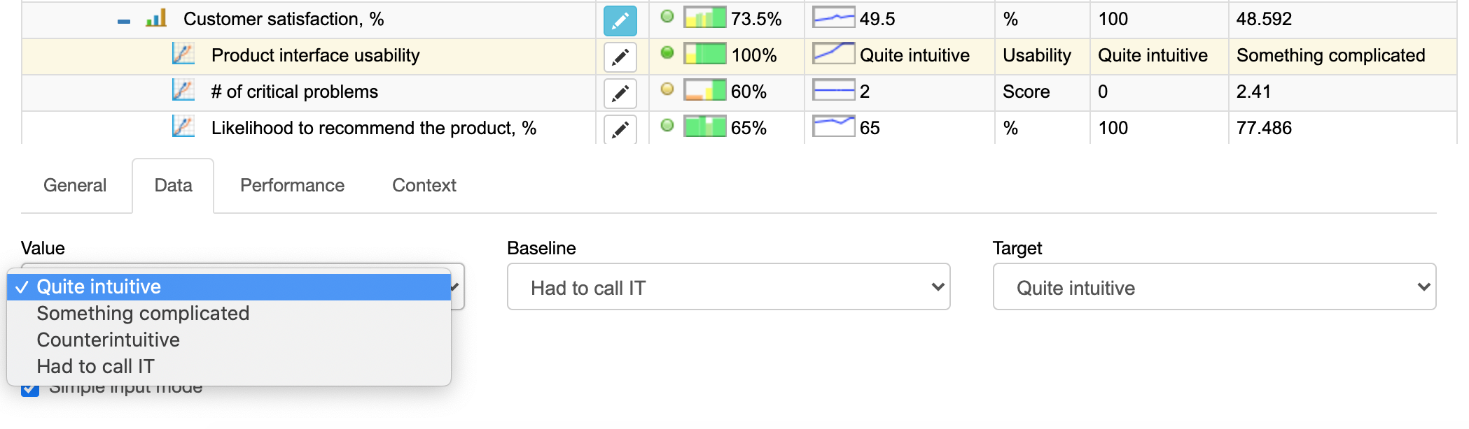
What do you think about “interface usability”?
- Quite intuitive – 100%
- Something complicated – 60%
- Counterintuitive – 30%
- Had to call IT – 0%
Definition of the Indicators
Just naming the indicators is not enough. For example, for the “# of qualified product improvement ideas” indicator, we need to be specific about the ideas that we consider qualified. For example, these might be the ideas that were accepted to the innovation pipeline.
The proper definition of the KPI is not just about its rationale or detailed description. We discussed the best practices about KPI definition in the previous article.
Repetitive Surveys
Another important idea of any survey is that we need to repeat it. For example:
- The customer satisfaction equals to 80% doesn’t actually tell us anything important.
Is 80% a high customer satisfaction? It depends… We don’t know for sure!
- What’s important is how customer satisfaction changes over time and how those changes match with other changes inside the business.
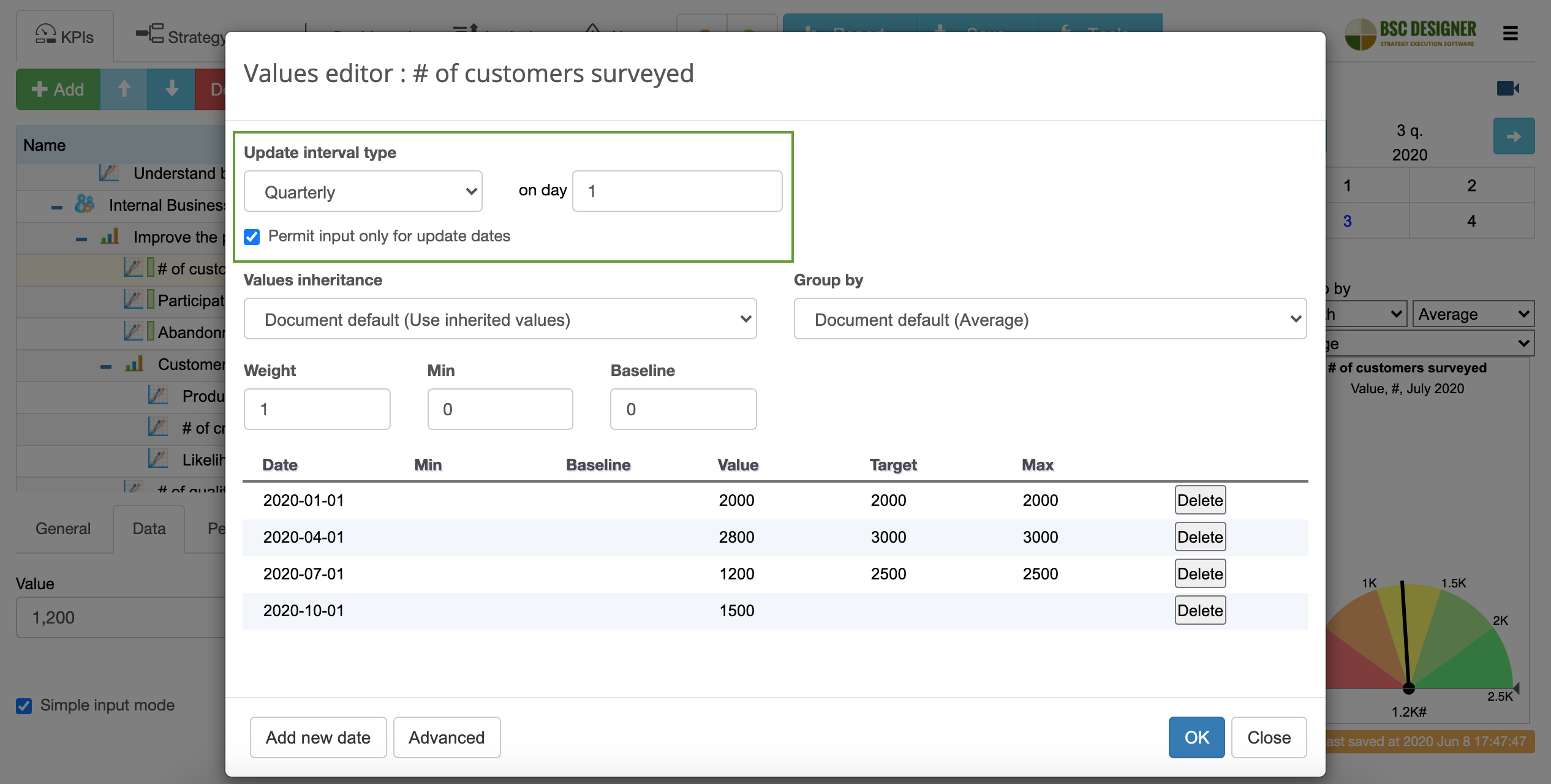
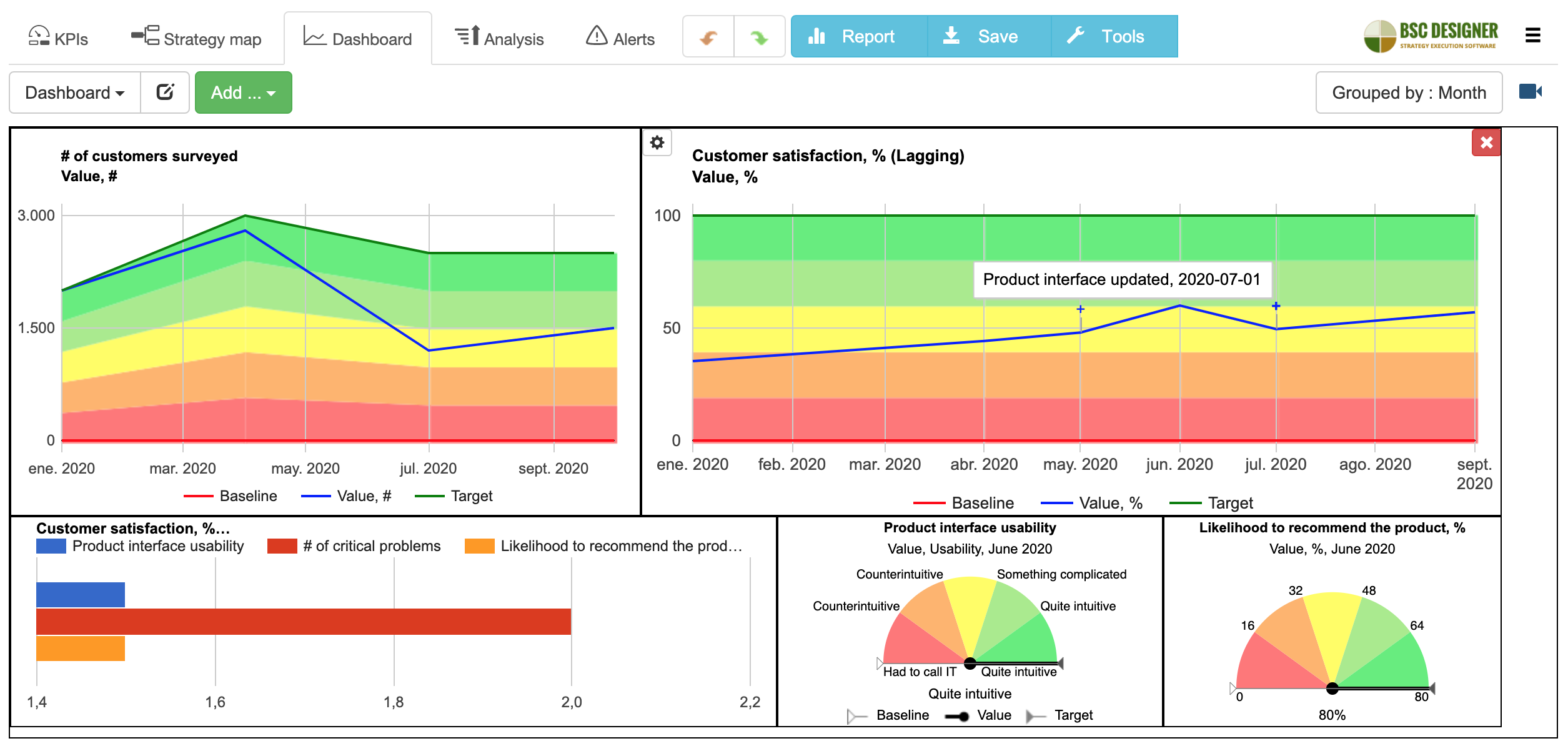
How to implement the idea of repetitive surveys into the strategy? The easiest approach is to pick the leading indicator, like # of customers surveyed and assign an update interval to it. For example, 1 quarter.
Comment on the Findings of Surveys
What happens when your team starts getting fresh results of the surveys? They start making business hypotheses!
- The interface usability score went down after we moved that button… Was it a good move? Do we need to roll it back? Do we need to record a video that explains this change?
Those insights are valuable, and the best way to capture them on a strategy scorecard is to use the comment feature of the automation software.
For example, in BSC Designer, users can create date-specific commentaries with the status “Comment.” Such initiatives can remain in a status of comment, or your team can develop them.
In my example, the team added these notes when they analyzed the results of the survey:
- Product interface updated
- Critical problem was found
Respectively, strategy software put these comments on the customer satisfaction chart.
Getting Data into Indicator
The survey initiative now has a strong connection with the strategy scorecard. We know what business goal is behind it, and we know how to quantify it. The indicator with a specified update interval will remind the team to repeat the survey regularly.
It’s time to discuss data entry:
- If you do just a few surveys, then you can easily enter the data manually
- If you do many surveys monthly, then importing data from Excel is a good solution
- Finally, if surveys are the core part of your strategic plan, then use RESTful API and web hooks.
Let’s Continue the Discussion
What survey-related tricks worked for you? Can you recommend a useful tool to conduct a survey, determine survey questions, prize/motivation to finish the survey? Feel free to share your thoughts in the comments.
![]() CEO | Author | Speaker
CEO | Author | Speaker
BSC Designer is strategy execution software that enhances strategy formulation and execution through tangible KPIs. Our proprietary strategy implementation system reflects our practical experience in the strategy domain.
This is very detailed and well explained. I loved the examples provided above for the Customer Satisfaction Survey and the strategy.