Learn how to design performance dashboards to support decision-making, visualize trends, identify performance gaps, and ultimately address the engagement problem of strategic planning.
Dashboard as a High-Level View of Strategy
In strategic planning, we deal with numerous complexities – from the multitude of strategy and functional scorecards to hierarchical business goals, initiatives, risks, and the key performance indicators (KPIs).
We need all these components to effectively perform value-based decomposition and capture all necessary details. When it comes to strategy execution, the high-level view provided by business dashboards is as important as the underlying details.
Let’s begin with some best practices for creating dashboards, and then focus on dashboards for strategic planning.
Start with Target Users in Mind
Before designing a specific dashboard layout, consider the target users.
Designing a dashboard for an operational team loaded with details is different from creating a high-level dashboard for senior management.
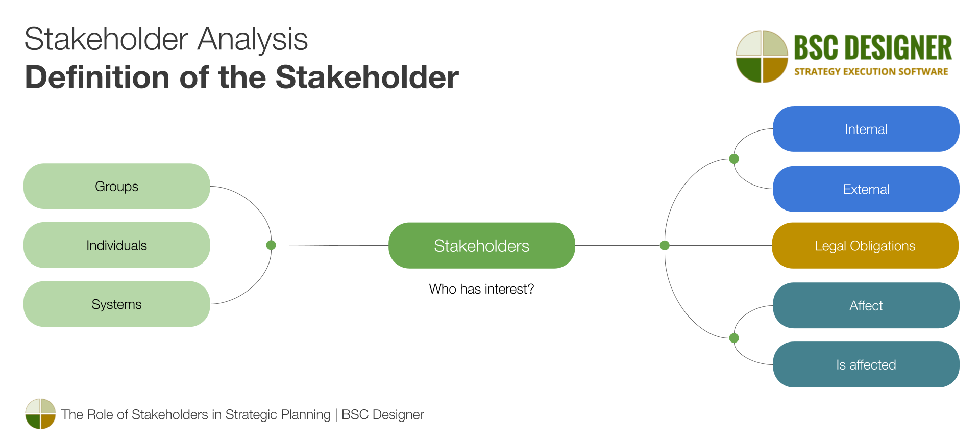
A shortcut is to leverage data from stakeholder analysis. Examine the internal stakeholders and their needs, then focus the dashboard on goals, metrics, and initiatives relevant to their areas of responsibility.
Decide What Story You Want to Tell with a Dashboard
Dashboards help to visually articulate the story of a strategy. Once you identify the target users, consider the questions they are asking.
Most likely, the target users are interested in mission-critical metrics:
- What is the current state?
- How does the current state compare to the previous state or the target?
- How does the data look when aggregated by quarters or years?
Metrics are easier to comprehend in context:
- How has a metric performed over time?
- What is the trend?
Users of the dashboard need to trust the data:
- Are all metrics up to date?
- Is the data consistent?
- What is the data source?
- What measurement method was used?
Dashboards are not merely visually appealing pictures; they are meant to generate insights and action plans. Typical questions the target users ask in this context include:
- What has been accomplished so far?
- What are the future plans?
- Are there any initiatives past their due date?
- What risks are we dealing with? Are they mitigated?
Tell Stories with the Titles of Charts and Diagrams
When creating a diagram using any tool, a standard title and subtitle are assigned, such as “Customer Engagement, %.”
A good diagram should tell a story, and the diagram’s title is the best place to do so.
Consider using more descriptive titles like:
- “Correlation between customer engagement and the number of support agents”
- “Seasonal changes in customer engagement”
- “Customer engagement by office”
- “The drop in customer engagement that we cannot explain yet”
Sometimes, filters are used to focus the diagram on specific data. For example, the initiatives can be filtered by the due date to display only those with approaching deadlines. Ensure that users of the diagram can see which filters were applied and what they mean. Again, a descriptive title like “Initiatives with approaching due dates” is better than just “Our initiatives.”
Make it Visually Attractive
While subjective, here are some common practices:
- Control the level of detail; start with the most important diagrams.
- Limit design to one screen; avoid scrolling if possible.
- Use spacing between diagrams.
- While most tools allow customizing colors, using a standard color scheme typically looks more professional and clear.
- Consider the target device; standard laptop screens, smartphone screens, or smart TVs require different chart layouts.
Dashboards in Strategic Planning are Different
There are many tools for data visualization, such as Microsoft Power BI, Tableau, Qlik, and Google Data Studio. While these are excellent tools for visualizing data, specialized strategic planning tools typically do a better job because they are equipped to visualize data relevant to strategic planning.
Seamless Integration within the Strategic Planning Process
A typical strategy scorecard includes three key components:
- Goals
- Indicators or metrics
- Initiatives or action plans
A dashboard is a simplified, aggregated version of a complex strategy scorecard. Ensure that users of your dashboard can drill down into the supporting data by clicking on diagrams. In this sense, dashboards created in strategic planning software have an advantage as they are seamlessly integrated with the strategic planning process.
Track Leading and Lagging Performance
In strategic planning, there are leading and lagging metrics. Leading metrics are related to success factors and activities, while lagging metrics are related to outcomes.
When communicating performance via a dashboard, ensure clarity regarding the type of performance being visualized:
- Leading
- Lagging
- Or both leading and lagging in the same chart to contrast efforts versus results
Initiatives on the Dashboard
Similar to tasks in project management, initiatives in strategic planning explain the action part of the strategy. Use Gantt charts to visualize initiatives and the relationships between them.
- List the actual initiatives, their statuses, and progress aligned with KPIs.
- List risks associated with the goals and their risk estimations.
Dashboard vs. Strategy Map
A strategy map is a diagram used exclusively in strategic planning. In contrast to a typical data-focused dashboard, the application area of a strategy map is the goals and the cause-and-effect connections between them.
A strategy map is the preferred choice when discussing and sharing the key ideas of a strategy. We compared dashboards and strategy maps in one of our previous articles.
Examples of Dashboards
Here are some examples of dashboards that you can find in the templates available in BSC Designer.
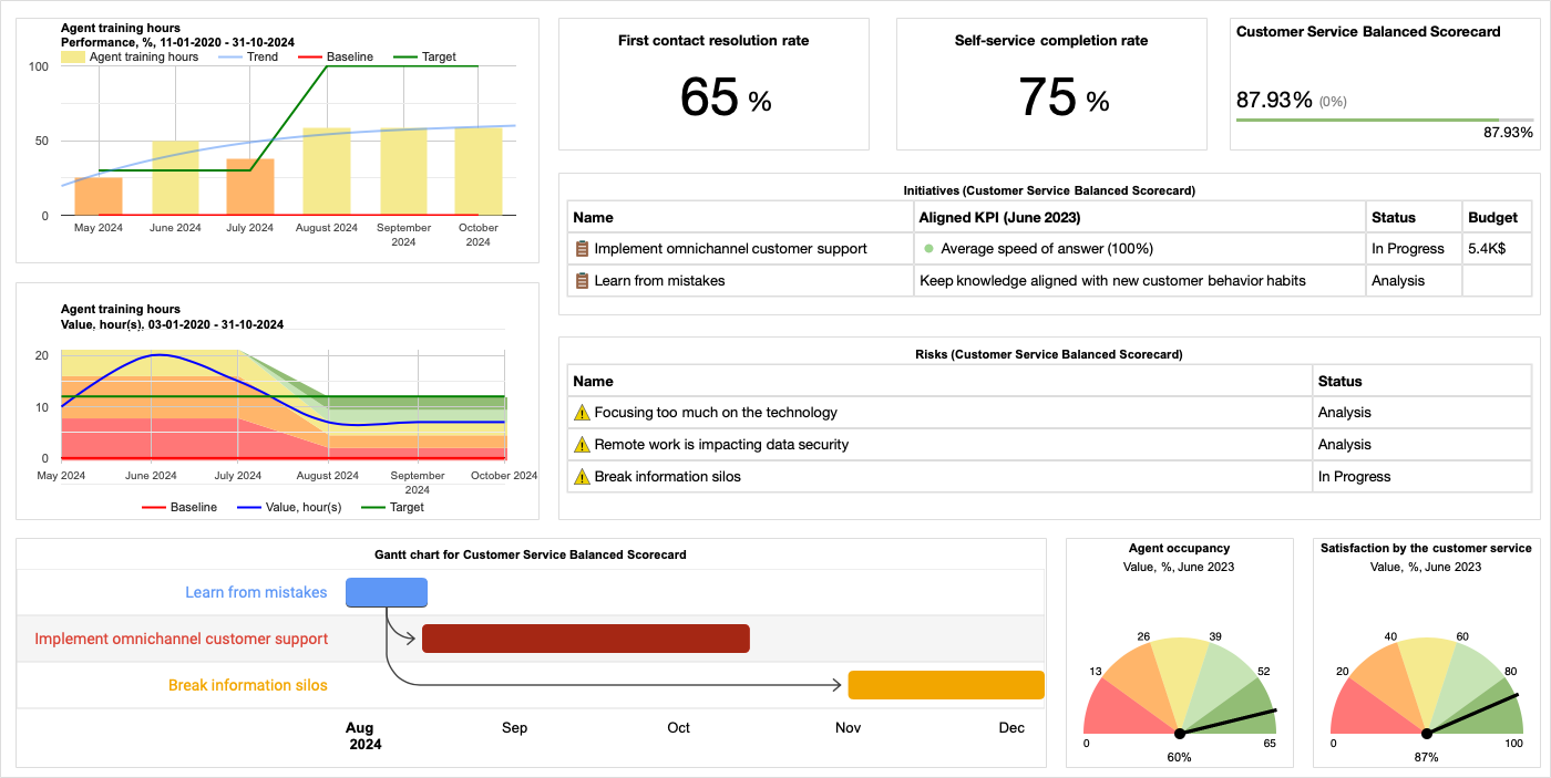
Customer Service Dashboard
The customer service dashboard is designed to display the current improvement initiatives and their impact on the first contact resolution rate, a key metric.
- Time chart displaying the evolution of indicators, their targets, and maximum values over the reporting period
- Key metric charts showcasing the current state of the two most important indicators (see “First contact resolution rate”)
- KPI indicator displaying the current performance of the overall scorecard (see “Customer Service Balanced Scorecard”)as well as its dynamics
- Initiatives diagram listing all active initiatives, their statuses, and budgets
- Risk diagram featuring active risks and their statuses
- Gantt chart showing the relationship between planned initiatives
- Gauge charts (see “Agent occupancy”) indicating the current state of the indicators on the defined measurement scale”
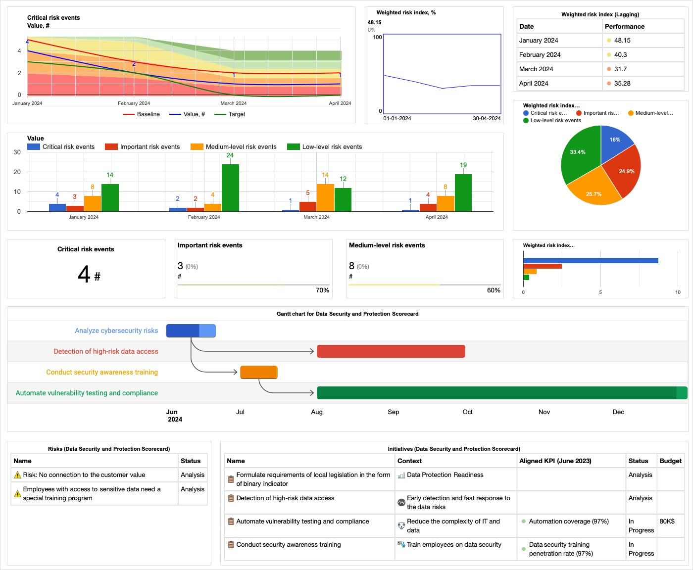
Cybersecurity Dashboard Example
The cybersecurity scorecard features two dashboards. The first one is the Risk Index Dashboard, which:
- Displays the evaluation of the weighted risk index over time
- Provides details on risks categorized by severity levels: low, medium, important, and critical
- Indicates the weight of each factor in the weighted index
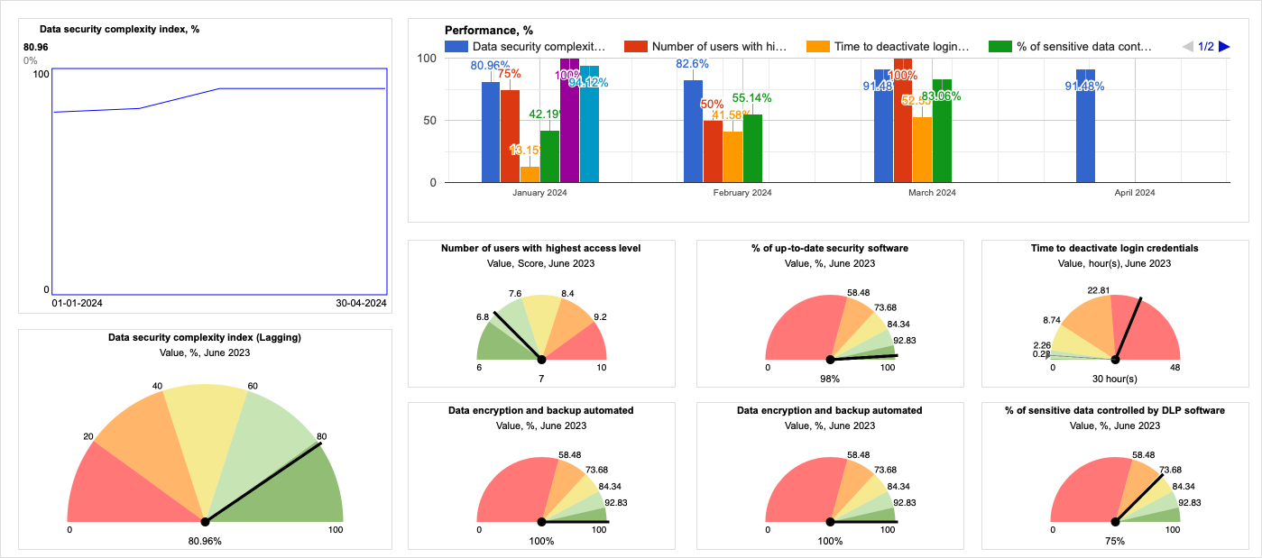
The second dashboard focuses on Data Security Compliance Index:
- The dashboard features a KPI overview chart displaying the evolution of the compliance index over time
- It includes several gauge diagrams showcasing the performance of the components of the index
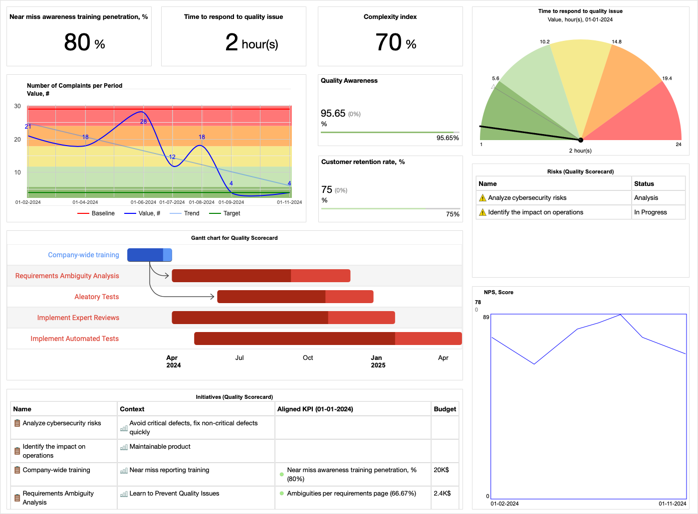
Quality Scorecard Dashboard
The dashboard features:
- Three key metrics
- Number of complaints per period with trend line
- Gantt chart illustrating dependencies between the initiatives
- Charts listing initiatives and risks.
Learn How to Automate Dashboards in BSC Designer
The software user manual includes a video tutorial that explains the key mechanics of using dashboards in BSC Designer.
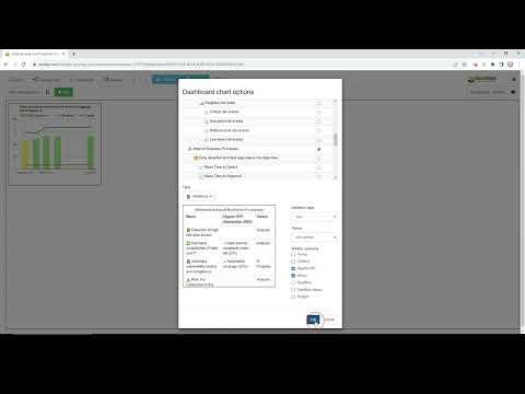
Here is a quick summary:
- There is a global dashboard that summarizes and visualizes data from all scorecards belonging to the user.
- There are local dashboards specific to a particular strategy or functional scorecard.
- Within one scorecard, you can have multiple dashboards.
- A dashboard can be marked as mobile-friendly, prioritizing it for users of smartphones.
- You can save a layout of the diagrams as a template and reuse it for other dashboards.
Inside a dashboard:
- Customize the title and subtitle.
- Drill down to supporting data by clicking on the dashboard.
- Enter data directly into the diagrams with the list of indicators.
Discussion and Presentation:
- Administrators can configure access to specific dashboards for users of their accounts.
- Users can provide a direct link to the dashboard for others to open.
- You can embed the dashboard to display on your internal network.
- Export a dashboard as a picture for use in presentations.
What is your experience with using business dashboards for strategic planning? Feel free to share your thoughts on the topic in the comments.
![]() CEO | Author | Speaker
CEO | Author | Speaker
BSC Designer is strategy execution software that enhances strategy formulation and execution through tangible KPIs. Our proprietary strategy implementation system reflects our practical experience in the strategy domain.