On a way towards digital transformation, start with digitalizing how your team presents and discusses strategy.
What comes to your mind when you hear “strategy presentation”? In most cases, the answer is “boring presentation slides.” You can do much better with a strategy map and specialized strategy planning software. In this article, we share some practical advice about migrating from slides to professional software for effective strategy presentations.
What is a Strategy Presentation?
It’s a way to tell a story about strategy. What kind of story will it be? It depends on who the target audience is and what the message is…
- Startup present a pitch deck with go-to-market strategy to potential investors
- Nonprofit organization shares their story with community and financial donors
- SMB company will use strategy presentation to keep everyone updated about what’s going on
- Larger organizations will do strategy presentations to synchronize efforts of functional units around a coherent strategy
Ideally, there should be some exchange of ideas with the participants.
Ultimately, the target audience of the presentation should have some tangible takeaways to implement in their function strategies and daily operations.
The Old Way: Present Strategy on the Slides
Here is a classical approach to design strategy presentation:
- Create visually appealing slides
- Explain a message that you focus on
- Add charts that support the message
- Tell the story slide by slide
- Do the Q&A session in the end
Such strategy presentations were rarely used outside of the board room. The real strategy work happened in numerous Excel spreadsheets.
The Ideal Scenario: Present Directly in Strategy Planning Software
During their digital transformation, many organizations moved their strategy-related activities from spreadsheets to specialized software. This opened a possibility to have a better strategy presentation investing less effort into preparation.
The ideal scenario would be to do a presentation directly in the specialized strategy planning software using real strategy scorecards with real data.
Here are the key benefits of this approach:
- Strategy map is a recognized strategy description tool, and most business professionals will be able to “read” the map
- No need to create slides – the strategy map is your most important slide and is created automatically
- No need to add charts – just use the dashboards you are regularly use for real strategy work
- The logic of your talk naturally follows the logic of the strategy map
- Your colleagues’ feedback can be implemented right away or gathered automatically
Many organizations have not unlocked the full potential of the strategy execution tools – they still ask their managers to:
- Extract necessary data and graphics from the software,
- Present it on the slides,
- Do the presentation, and
- Process the feedback from colleagues manually.
Cultural Shift to More Effective Strategy Presentations
Below, we discuss some specific techniques to make an effective strategy presentation with strategy planning software.
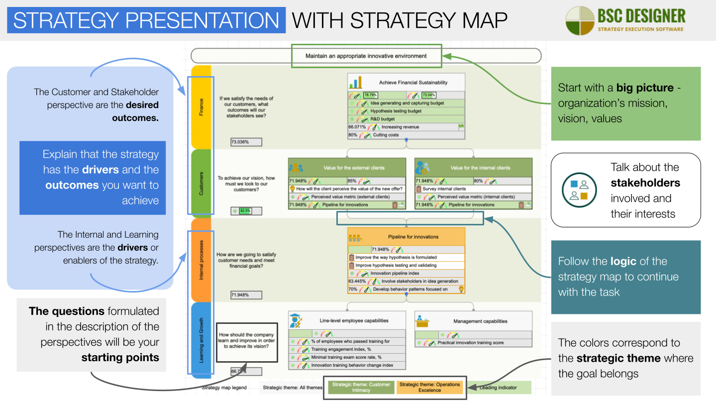
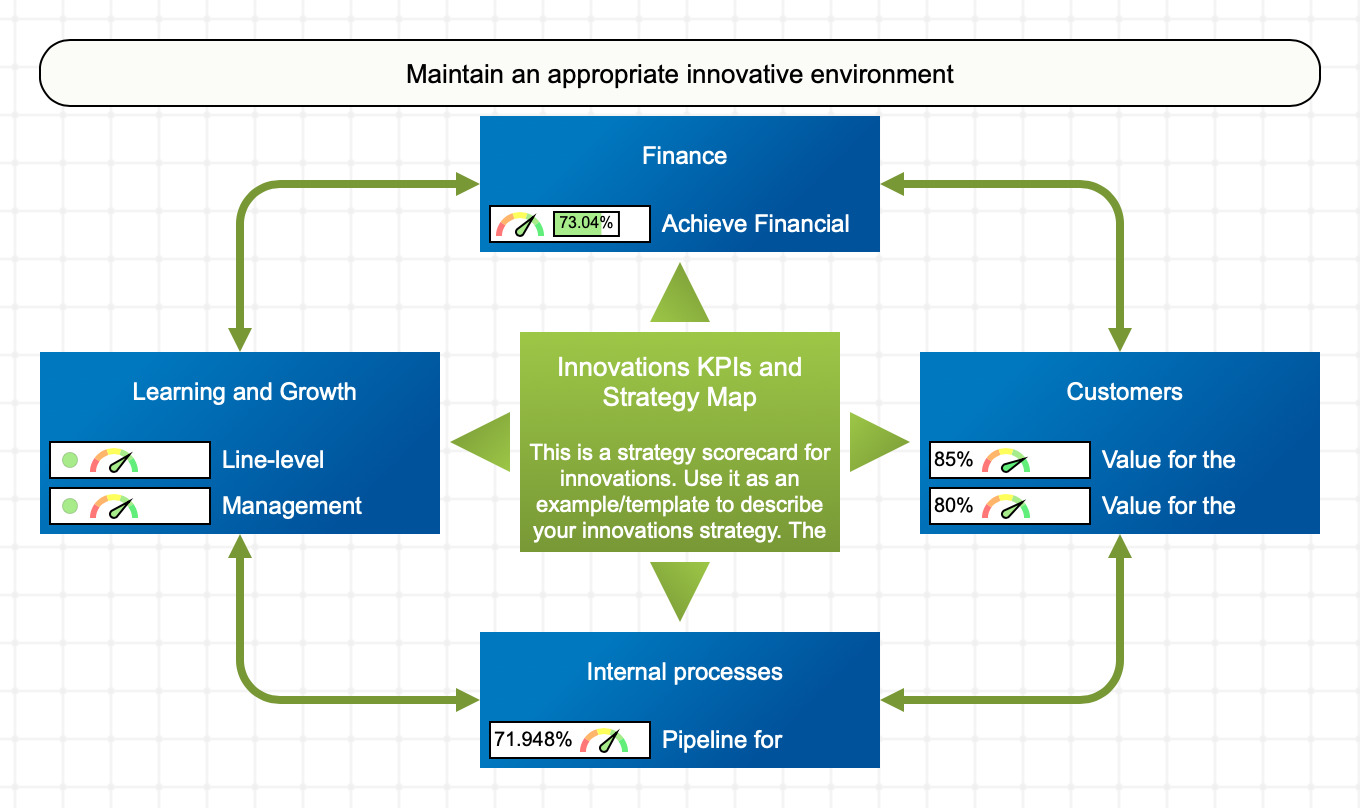
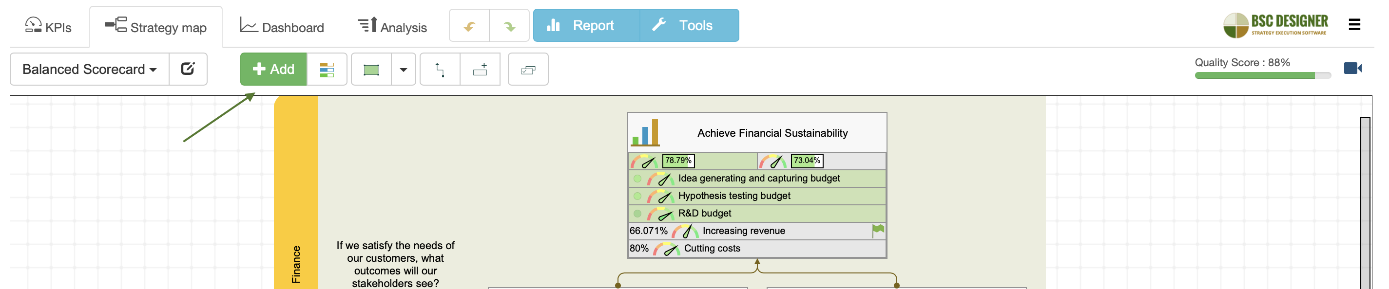
The Strategy Map is the Main Slide of Your Strategy Presentation
A strategy map is a visual picture that the strategy execution software creates and updates automatically using the information about your goals, indicators, and initiatives.
Strategy presentation is about “reading” a strategy map correctly:
- Start with a big picture, especially if your company is new to the participants. Talk about the organization’s mission, vision, values, strategic themes, and overall strategy
- Explain that the strategy has the drivers and the results you want to achieve
- The Internal and Learning perspectives are the drivers or enablers of the strategy
- The Customer and Stakeholder perspective are the desired outcomes
- The colors of the goals on the map correspond to the strategic theme where the goal belongs
- Talk about the stakeholders involved and their interests
Follow the logic of the strategy map to continue with the talk:
- The questions formulated in the description of the perspectives will be your starting points
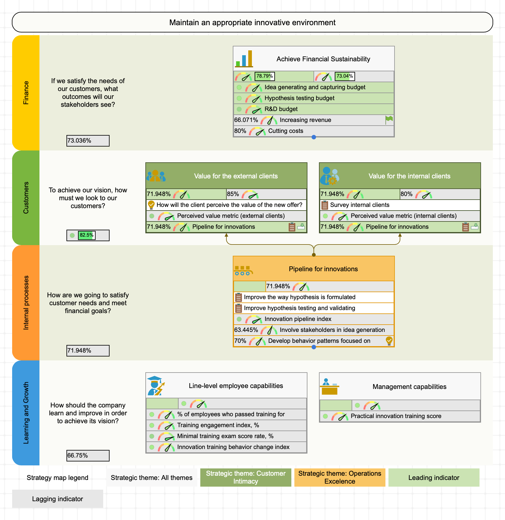
On a properly designed strategy map, the big picture of the strategy should be split up into small and independent sub-goals measurable by the value created for the stakeholders.
- The sub-goals are the rectangles on the map
- The links between the goals explain the cause and effect logic
- The indicators show how the value created for the stakeholders is quantified
Explore in detail the goals that require more attention:
- How is the goal quantified?
- What is current progress?
- What risks were identified?
- What are the action plans?
- What hypotheses are you going to test in execution?
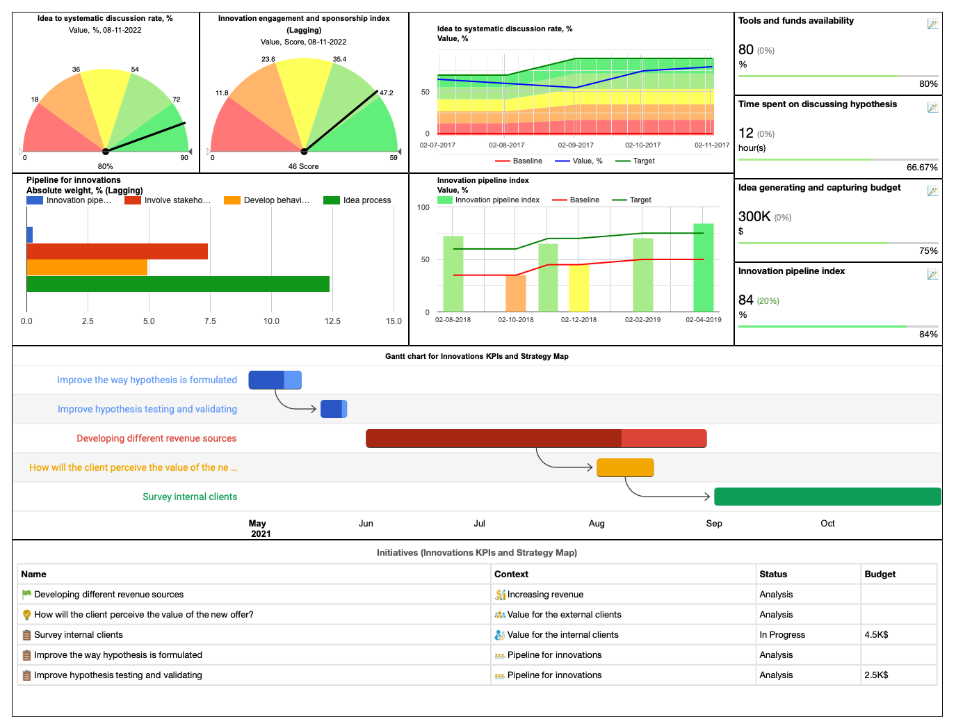
The automation features will help to make the story more engaging:
- Fold/unfold certain parts of the map
- Switch to the dashboards to see the trends and charts for the most important KPIs
- Add a Gantt chart to the dashboard to visualize initiatives, the connections between them, and general timeline of strategy
- Switch to the KPIs to support your arguments with live data
- Click on the risks to see risk definitions and suggested mitigation plans
- Open initiatives to see the budgets, timeline, and other detail of your action plans
If you are just starting to work on your strategy, the AI-powered strategy score tool will help you create a strategy map according to the latest industry standards by including all required information and avoiding typical mistakes.
You are not limited to one map only!
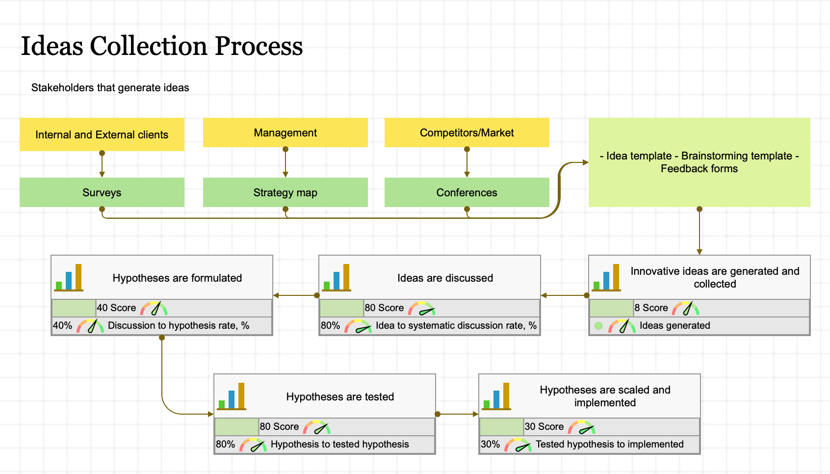
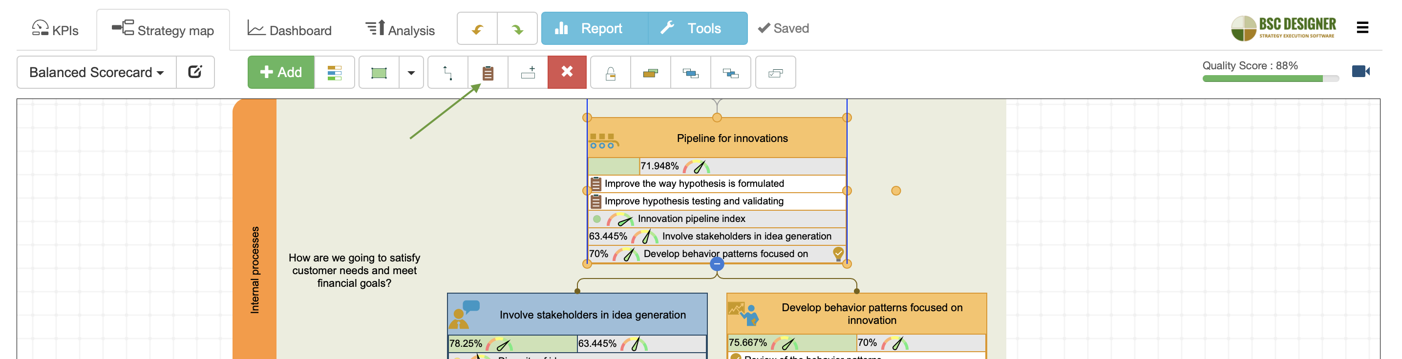
Process map
For example, in a scorecard for innovations, we used process maps to illustrate the key processes involved in innovation strategy. That’s an excellent way to demonstrate how the value is created in your organization.
Overview map
When you do a presentation for the general public, you can create an overview strategy map that won’t include that much detail – just the key perspectives and the goals inside.
Consult Underlying Data to Answer Tough Questions
During the strategy presentation, you might have some tricky questions…
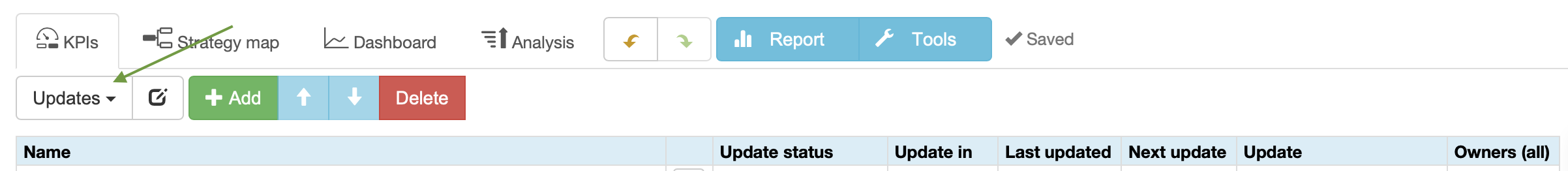
Are we looking at the fresh data? When was it last updated?
On the KPis tab, change the view to Updates. The table below will display when the indicators were last updated and what is their update schedule.
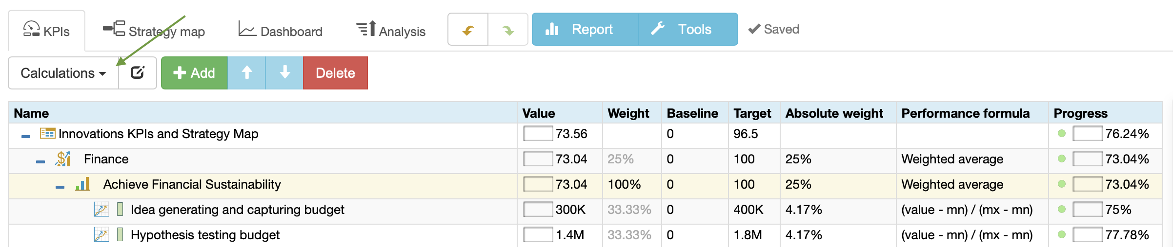
How did we get the number for this indicator?
This answer is typically formulated in the description field of the indicator. For high-level goals that are calculated using the values of other indicators, change to the Calculations view on the KPIs tab. It will show the formulas used for indicators.
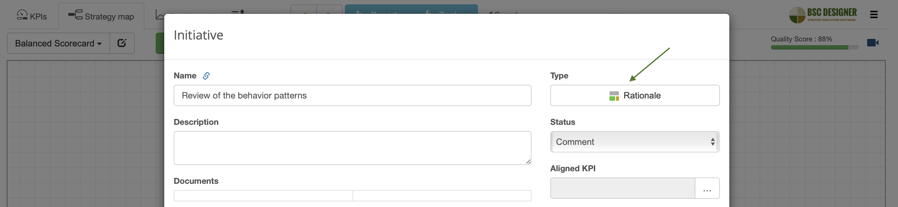
What rationale/context stands behind this goal?
The rationale can be aligned with the goal or indicator via the Initiatives dialog.
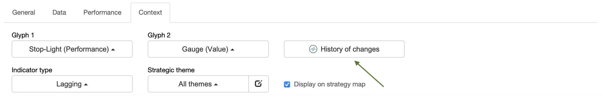
For some more general contextual information, use the History of changes button available for the goals, indicators, and initiatives. It can show, for example, that the origin of some goal is PESTEL or SWOT analysis conducted some time ago, or that the goal was previously formulated in a different way.
What did we decide to do about this goal in the last meeting?
The comments from the participants of the presentation can be noted down right away. On the next strategy meeting, you can check out these comments via the Initiatives view on the KPIs tab.
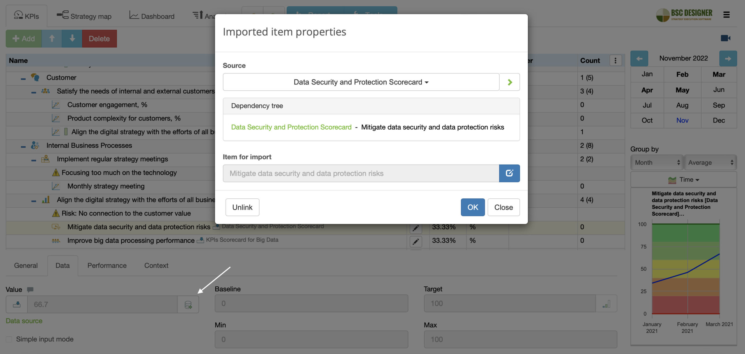
How does this goal contribute to the overall strategy?
When two scorecards are linked by the data, the software creates an imported indicator. Go to the Data tab to see the data source and the dependency tree. Open supporting scorecards if needed.
Who suggested this goal, changed targets, added initiatives…?
All the goals and initiatives in the software have their owner. Additionally, with an audit trail, the users can see the history of items, including such events as updating values, targets, and adding initiatives.
Presentation On the Go
Sometimes, interesting questions come up when you are not in the boardroom, have no laptop, no slides, just a smartphone.
In BSC Designer, presentation mode is activated automatically on the small screen. It hides all unnecessary controls, helping you to navigate across strategy maps and dashboards easily.
Write Down the Feedback Immediately
The most valuable part of any strategy presentation is the discussion that happens afterwards. A great benefit of using strategy planning software for the presentation is a possibility to note down those valuable comments directly in the strategy scorecard.
Comment on the values of KPIs
There might be some interesting discussion about certain KPIs.
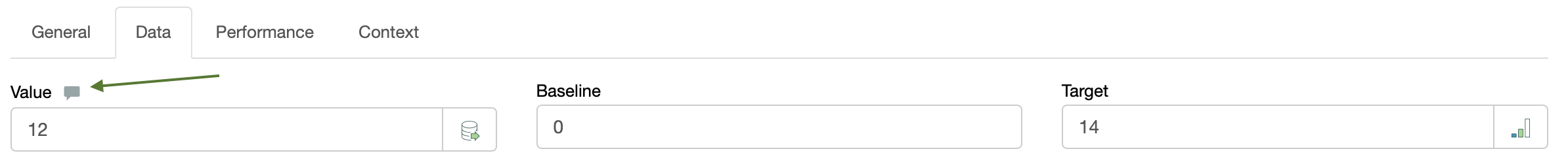
- Why did its value suddenly drop or increase more than expected?
- What can we do to get the KPI out of the red zone?
Note down those findings with the comments function for the value of KPI.
Modify the map on the fly
Implement the ideas on the strategy map immediately – create new goals, indicators, hypotheses, risks or initiatives.
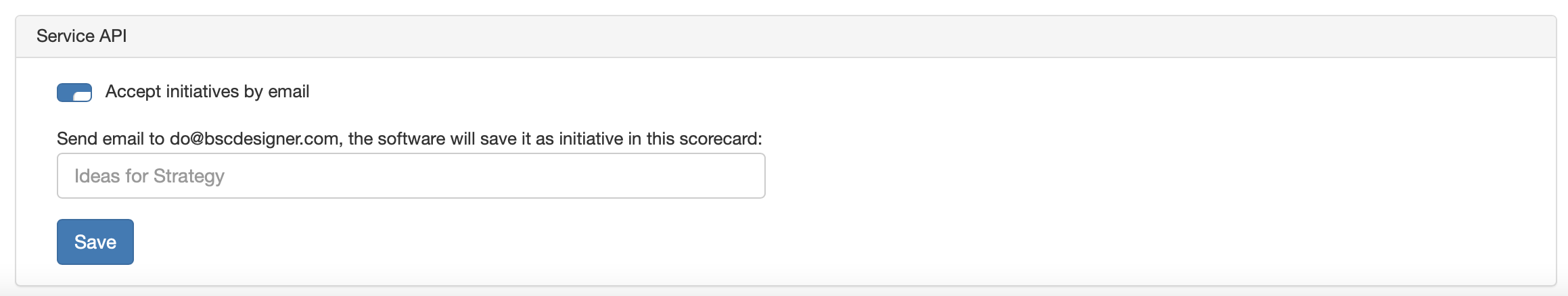
A dedicated channel for new ideas
In change management, it’s critical to have a dedicated channel for new ideas. Strategy is not an exception. Members of your team can send their ideas to the dedicated email. The software will convert emails into the initiatives and save them into a special scorecard called Ideas for strategy.
Change the Strategy Dynamically
A typical presentation is a fixed document. A real strategy is not. With specialized software like BSC Designer, you can ask the key strategists to introduce changes in the strategy right away.
It’s amazing to see how people work on the strategy simultaneously, adding new hypotheses, breaking down complex goals into more tangible parts.
Automate Handouts and Follow-up
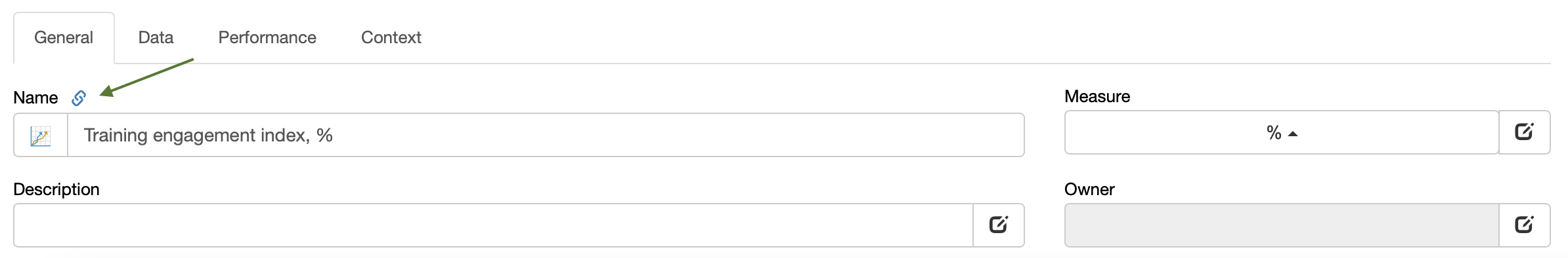
Before the presentation, the attendees expect to have some handouts. Printing materials doesn’t sound like a sustainable idea. Instead, send out the link to the strategy scorecard that you are going to discuss so that the participants can follow you and drill down into the data they are interested in.
After the strategy presentation, you can send a follow-up email. To illustrate some specific points, you can add direct links to the specific KPIs, goals or initiatives.
If you need a formal document with some goals, KPIs, and strategy map, you can use the Report function. See for example, the Strategic plan report.
Short Strategy Presentation
Pecha Kucha is a presentation style that came to us from Japan. You have 20 slides, and each slide is shown for 20 seconds only. This presentation style is known as the killer of boring PowerPoint slides.
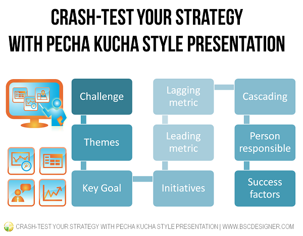
An organization’s strategy is a complex thing – make sure that each team is presenting its own piece of the strategy.
Strategy Presentation Template
Here is a template of a short strategy presentation in Pecha Kucha style.
- In our business unit, we see our main challenge as …
- And there are 3 directions that we are going to address in 2020 to move ahead with this.
- Mention a key goal from strategic theme 1.
- What are your key initiatives about this business goal?
- Explain what leading indicator you will monitor to make sure you are on the right track.
- Explain what lagging indicator you will track to make sure that the result was achieved.
- How is a previously mentioned goal related to the next big goal? Use your strategy map to show the cause-and-effect connection.
- Mention a key goal from strategic theme 2.
- What are your key initiatives about this business goal?
- Explain what leading indicator you will monitor to make sure you are on the right track.
- How is a previously mentioned goal related to the previous and/or next big goal? Use your strategy map to show the cause-and-effect connection.
- Explain what lagging indicator you will track to make sure that the result was achieved.
- Mention a key goal from strategic theme 3.
- What are your key initiatives about this business goal?
- Explain what leading indicator you will monitor to make sure you are on the right track.
- Explain what lagging indicator you will track to make sure that the result was achieved.
- How is a previously mentioned goal related to the previous big goals? Use your strategy map to show the cause-and-effect connection.
- How is your strategy aligned with the overall company’s strategy? How is it cascaded to the lower levels.
- Who will be responsible for the execution of your strategy? Mention some names and show headshot photos so that people know who will be in charge.
- If your timing allows, repeat again what you plan to achieve, why, and what the key success factors are.
Summary
Here are the general benefits of doing strategy presentation directly in the strategy planning software:
- In does not require additional effort from your team – you already have all necessary data in the software, no need to spend time working on the slides
- The presentation will be much more productive compared to a classical presentation – you will show fresh data, you will drill-down in supporting detail and contextual information, you can introduce changes and ideas directly into the strategy scorecard
- It can be done anytime, most likely you will stop calling it strategy presentation, it will be just a simple meeting where you talk about strategy in a disciplined way
- Instead of paper hangouts, the participants will have a link to the strategy scorecard; in the follow-up notes, you can make references to the specific goals, KPIs, or initiatives
- There is no gap between the presentation and the real work – you are going to use the same platform for the presentation that you use to manage your KPIs and goals daily.
![]() CEO | Author | Speaker
CEO | Author | Speaker
BSC Designer is strategy execution software that enhances strategy formulation and execution through tangible KPIs. Our proprietary strategy implementation system reflects our practical experience in the strategy domain.