Review of the prioritization frameworks that help to make data-driven strategic choices by defining a priorities model and calculating priority score.
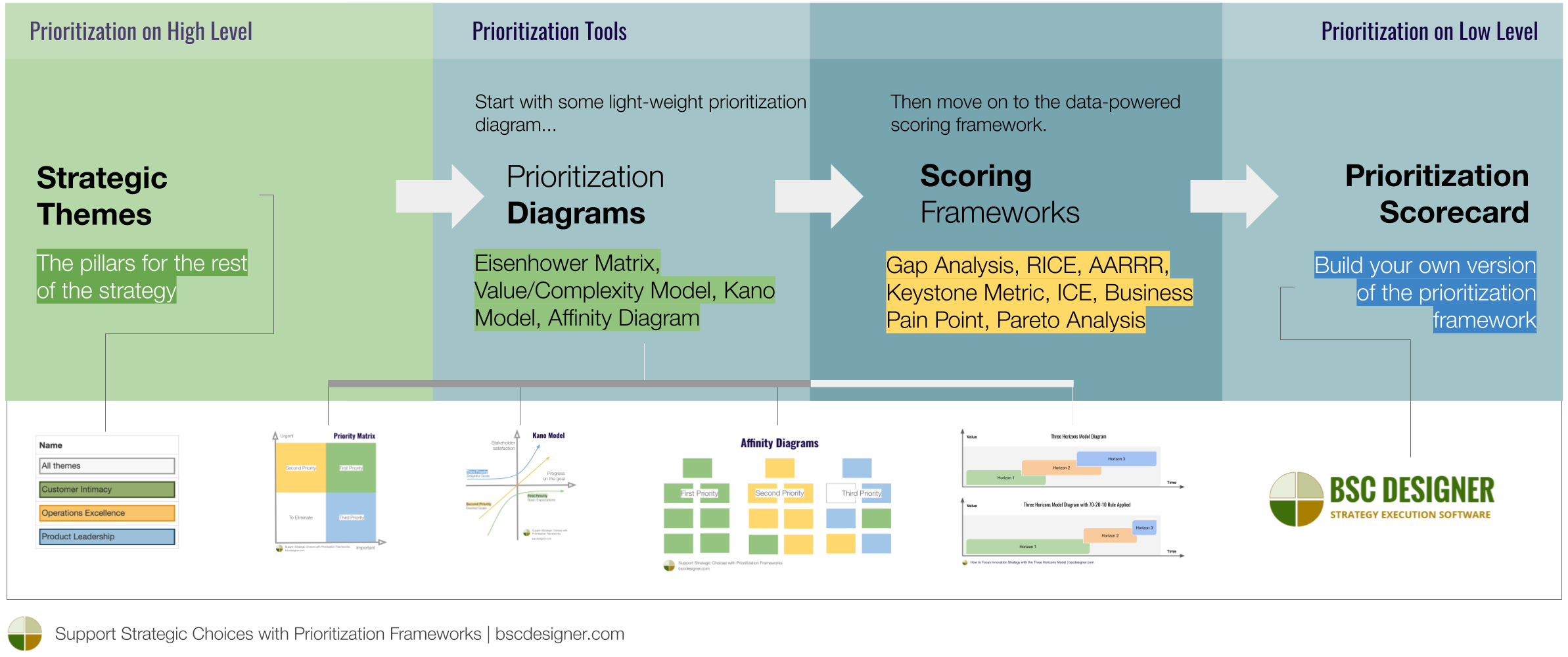
In strategic planning, prioritization starts with defining the high-level strategic themes that work as pillars for the rest of the strategy. What about making choices on lower levels? After using the strategic themes as an initial filter, we would still have too many choices and competing ideas.
In this article, we talk about the various prioritization frameworks that help organizations to address this challenge. The key topics of the article:
- Prioritization diagrams: Eisenhower Matrix, Value/Complexity Model, Kano Model, Affinity Diagram
- Scoring frameworks: Gap Analysis, RICE, AARRR, Keystone Metric, ICE, Business Pain Point, Pareto Analysis
- Prioritization template. An example of using a scorecard to prioritize goals.
Challenge of Prioritization
Let’s take a typical situation that exists in any product company. The backlog is full of interesting ideas suggested by different stakeholders:
- Important clients need something urgently
- Technical support believes that certain feature will make their job easier
- Developers suggest architectural changes to improve the quality of the product
- Board members think that some feature will help to reach a new market
A number of prioritization frameworks can help to focus on the most important ideas. These frameworks can be divided into:
- Prioritization diagrams – graphical diagrams that help to do a quick analysis of the ideas.
- Scoring frameworks – prioritization scorecards that take into account various weighted factors and calculate the final priority score.
Below, we will discuss both types of prioritization frameworks. Which one to use? Common sense suggests starting with some light-weight prioritization diagram and then move on to the data-powered scoring framework.
Prioritization Matrices and Diagrams
To get started with prioritization, we can use one of the prioritization diagrams.
Priority (Eisenhower) Matrix
The Eisenhower Method or the Urgent/Important matrix is well known in the time management domain. The axes for the quadrants are “Urgency” and “Importance.”

- The goals from the “Urgent / Important” quadrant are the first priority
- The goals from the “Less urgent / Important” quadrant are the second priority to plan working on later
- The goals from “Urgent / Less Important” are the third priority and supposed to be delegated
- The goals from “Less Urgent / Less Important” should be eliminated
Similar idea is covered by the MoSCoW model. The acronym stands for:
- M – Must Have
- S – Should have
- C – Could have
- W – Will not have
Value vs. Complexity Matrix
Similar to the priority matrix, the diagram is divided into four quadrants. The axes are “Value” and “Complexity.” Sometimes, the complexity is replaced with “Cost” or “Effort.”
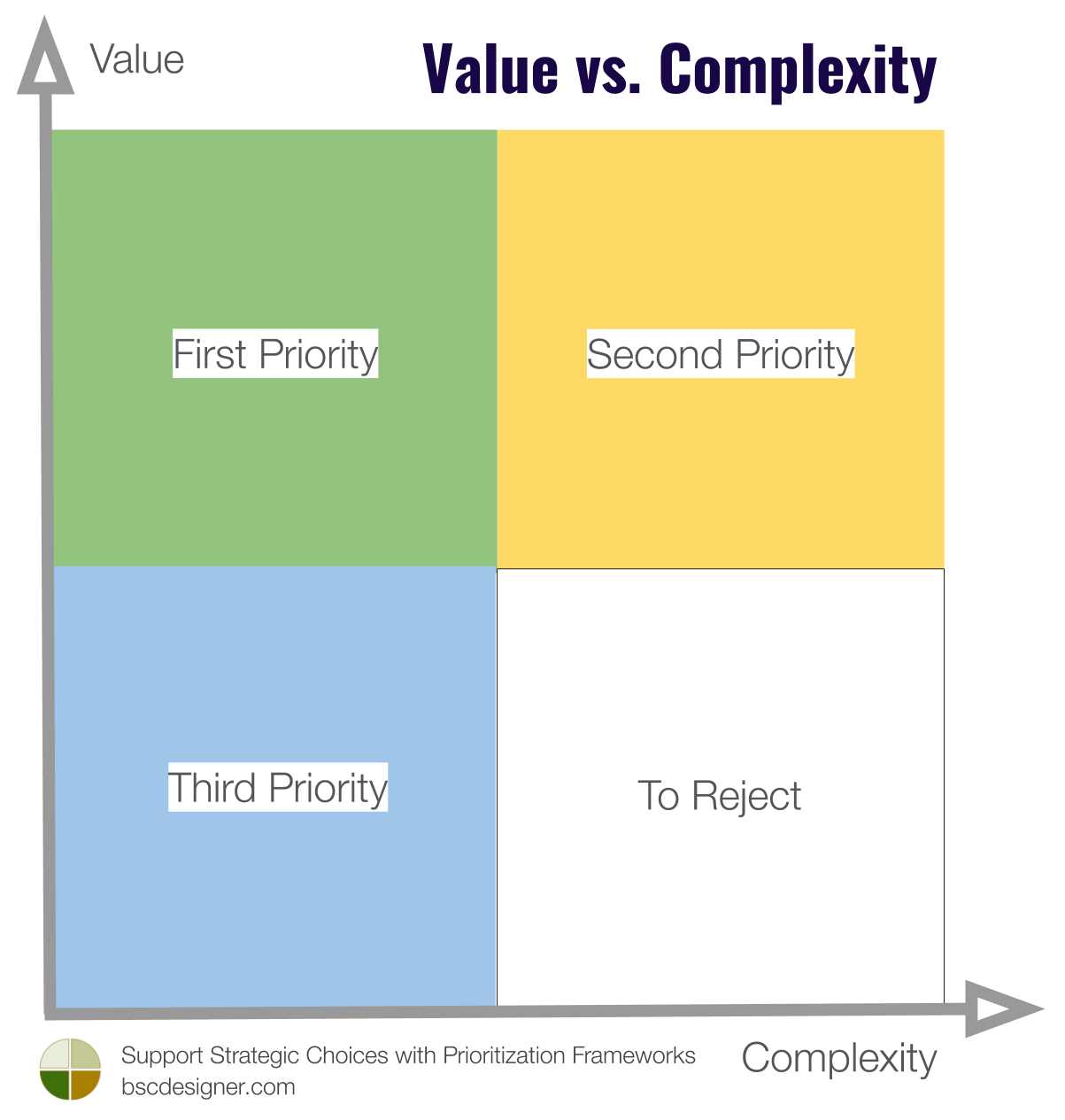
- The first priority (the easy-wins) are the goals from the “High Value – Low Complexity” quadrant
- The second priority is the goals from the “High Value – High Complexity” quadrant
- The goals from “Low Value – Low Complexity” have the third priority
- Finally, the goals from “Low Value – High Complexity” are normally rejected
Eliminating complexity itself might be a good priority, as it is typically aligned with the value for many stakeholders.
Kano Model
With the Kano Model, we measure the stakeholder satisfaction versus progress on the goal. The stakeholder satisfaction is quantified on the nonlinear scale from dissatisfaction to indifference and excitement.
- With the Kano Model, the priorities are assigned according to the value perceived by the stakeholders.
In the context of strategic planning, using the Kano Model is especially interesting when setting the performance targets for the goals. For example, the customers might be very enthusiastic about reducing the defects rate from 1% to 0.01%, but reducing defects to 0.001% might not create any tangible value (see the cost of high quality as an illustration for this idea).
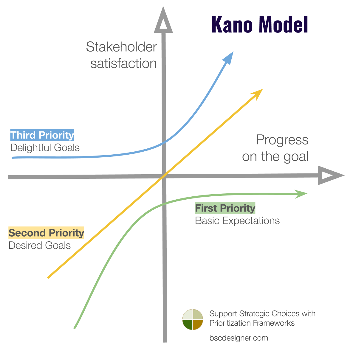
The Kano Model underlines the need to think about the full lifecycle of an idea. For some ideas, we have to say “No,” even if they are easy to implement in the beginning.
- Think about the long-term effects of a “small improvement” suggested by your stakeholders. How will those changes affect the total complexity of the system?
Affinity Diagrams
In strategic planning, affinity diagrams are good for the initial review of the business landscape. Imagine that the stakeholders have a long list of ideas.
- Find similar ideas
- Group ideas into bigger clusters
- Re-formulate your goals accordingly
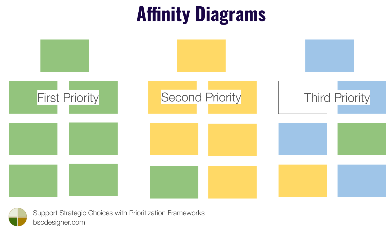
Here is an example from our practice:
- One user of BSC Designer required displaying values on the charts when exporting dashboards
- Another user suggested that it would be a good idea to display the captions with the values on the charts
A common cluster idea, in this case, was that all charts with the data should have the “show annotations” option:
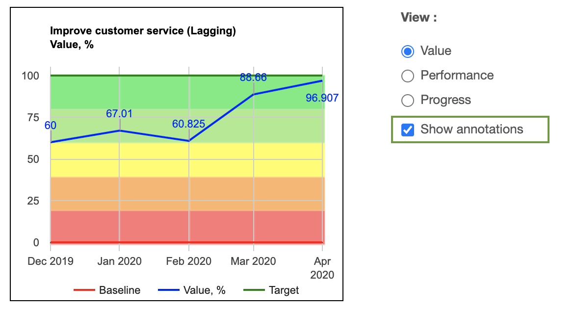
Two standalone ideas did not gain enough weight to become a priority, but when seen as a cluster, it became obvious that the function is required in different forms by many users.
Prioritization with “Strategic” Frameworks
Finally, it’s worth mentioning that there are some frameworks that traditionally belong to the strategic planning toolkit, while in essence, they are prioritization frameworks:
We can also name Pareto Analysis and Gap Analysis that we discuss below.
Prioritization with Scoring Frameworks
Now, let’s see if we can support strategic choices better by calculating a priority score. In essence, all scoring frameworks are about analyzing the possible ideas using certain parameters.
Here are some common principles of scoring frameworks:
- There are factors that impact the priority score positively, like value created for the end-users and marketing opportunities
- There are factors that impact the priority score negatively, like costs, efforts, and risks
- The impact of the factors is quantified as a priority score
- The degree of the contribution of a certain factor is defined by its weight
- The factor’s scores are normalized to calculate the final priority score
Let’s review some of the scoring frameworks in detail.
Gap Analysis
The Gap Analysis is a basic scoring framework. Instead of introducing the factors and evaluating options according to those factors, we use easily available data – the performance of certain goals as measured by their performance indicators.
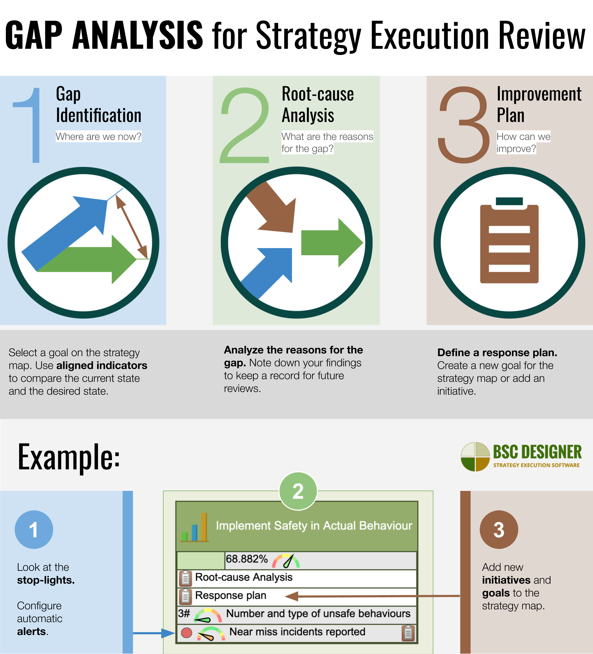
The highest priority is assigned to the goals with the most significant performance gap and the highest absolute weight.
There are various derivatives of the gap analysis, like, for example, Opportunity Scoring that comes from an outcome-driven innovation process.
RICE Framework
The RICE scoring model was developed by software company Intercom. The acronym of the framework stands for:
- Reach – an estimation of the number of stakeholders affected
- Impact – a quantification of the expected value created for the stakeholders as a result of reaching the goal (in the case of Intercom, the scale was from 0.25 to 3)
- Confidence – whether the decision is based on pure intuition or there is some data that supports the choice
- Effort – an estimation of the resources needed to reach the goal
AARRR Framework
AARRR framework (also called Pirate Metrics) is popular among startups. The acronym stands for:
- Acquisition – getting more users for the product
- Activation – making users unlock the potential of the product
- Retention – giving users the reasons to use the product for a longer time
- Revenue – increasing revenue by, for example, increasing average check
- Referral – making users recommend your product to others
Ideas and goals are scored using AARRR’s components as parameters. The goal with the highest score has the highest potential to impact business positively.
North Star or Keystone Metric
Both the “North Star” and “Keystone” metric refer to the same idea:
A single metric that quantifies the value the organization creates for the customers
Instead of using many validation parameters, as we did with the previous frameworks, we look at just one factor – the potential impact of the suggested idea on the keystone metric.
For example, when we were talking about metrics for safety, we used the Alcoa company as an example of a keystone metric. In their case, the metric was focused on the number of safety incidents.
- The idea of using just one metric to prioritize all business goals sounds very attractive, but in reality, the complexity of choice was not limited, it was just moved to a different place.
For example, if we want to understand how the new partnership network would impact the North Star metric, we would need to analyze and quantify all the challenges in the middle, and this doesn’t make the prioritization task any easier.
ICE Scoring
ICE scoring is an interesting derivative of the North Star metric. The ICE formula is as simple as:
- ICE Score = Impact * Confidence * Easy
Where:
- Impact is a projected impact on the key value metric (the North Star metric)
- Confidence is a quantification of the degree of accuracy of the impact estimation
- Easy is an estimation of the efforts (costs, resources needed, etc.)
The values of the ICE parts are presented on a scale of 1-10. Once multiplied, they give us a priority estimation to compare one idea against another.
Assigning the scores is quite subjective. For example, for Confidence, the scale might be like this:
- 10 – results of the real implementations
- 6 – results of the test, MVP
- 4 – top users requested this
- 3 – supported by some customer data
- 1 – few potential customers mentioned this
- 0.1 – ideas from non-users (mentioned by industry experts or press)
Business Pain Point
Similar to the North Star and Kano Model, the focus of this model is on the value for the customers. The major difference is that we look at the value from the viewpoint of pain points.
How to find those pain points? Be the customer of your product as we discussed in the complexity article, or simply ask your clients using light-weight surveys.
Pareto Analysis
Before, we discussed Pareto Analysis as a strategic planning tool. In terms of prioritization, Pareto Analysis promotes a very simple idea:
80% of the value created is attributed to 20% of the activities
While the historical analysis typically confirms the 80/20 ratio, there is no simple way to find those 20% beforehand.
Basically, the mentioned ratio:
- Justifies the use of prioritization frameworks and
- Suggests limiting the experiments to those most promising 20%.
Using Scorecard to Prioritize Goals
What strategy prioritization frameworks should your organization use and how to calculate a priority score?
In practice, most organizations build their own version of the prioritization framework. For the users of BSC Designer, we have included the prioritization template in the templates available in the software.
Below we discuss:
- How to build your own prioritization scorecard
- An example of using this template
Prepare the Prioritization Template and Scorecard
Create a new scorecard using the “Prioritization” template:
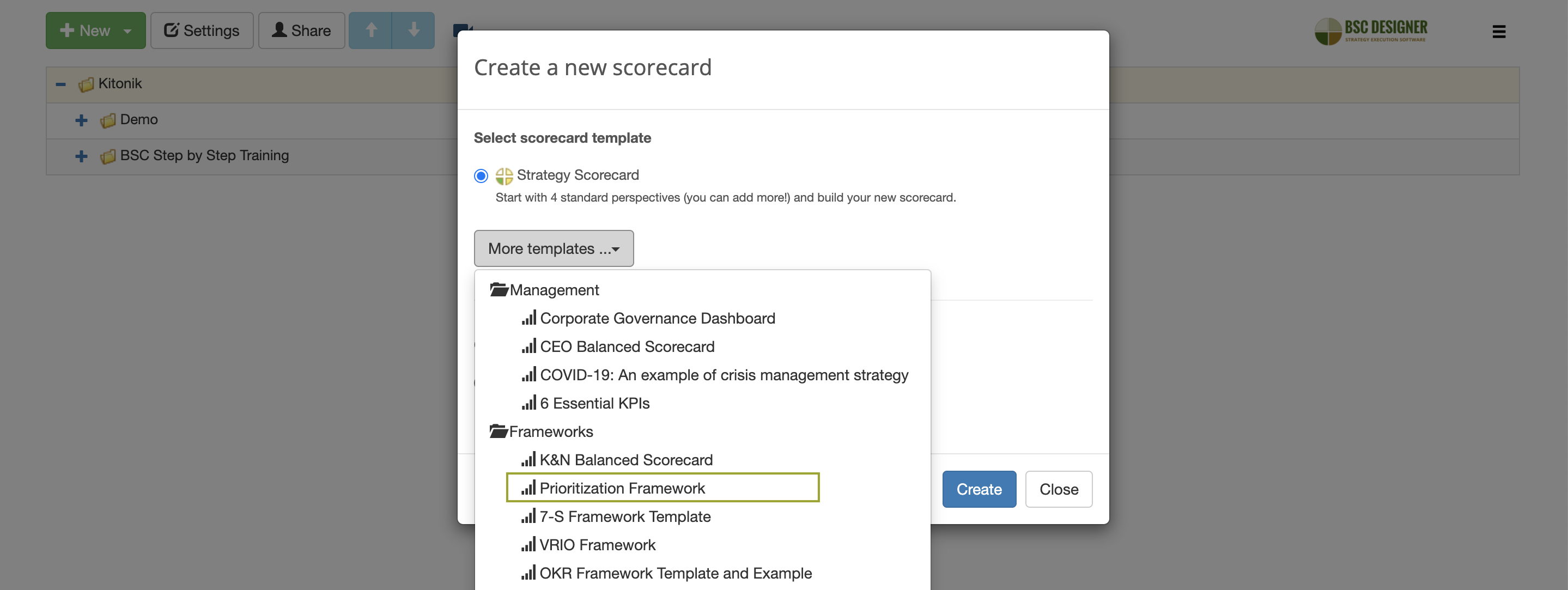
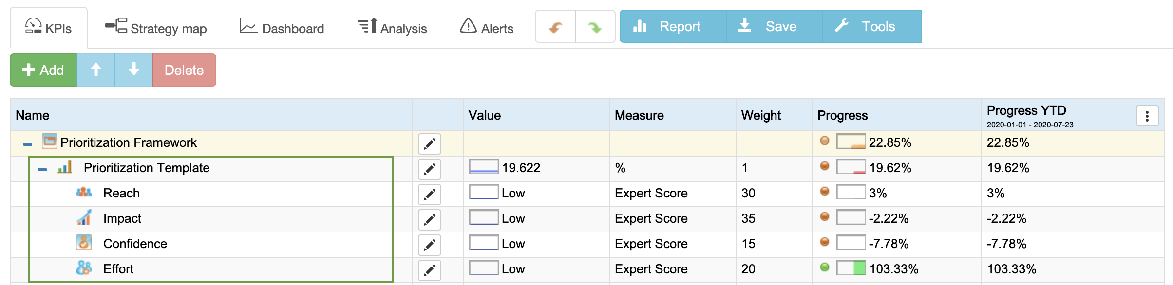
In the “Prioritization template” group, you will see the list of the default evaluation parameters. We used parameters from the RICE framework for this example.
Let’s see how these parameters are pre-configured and how they can be adjusted according to the needs of your prioritization model.
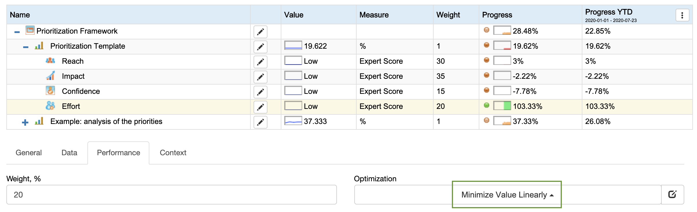
Weight of Parameters
Each parameter has a relevant weight (see the “Weight” column). The weight of a specific parameter can be changed on the “Performance” tab.
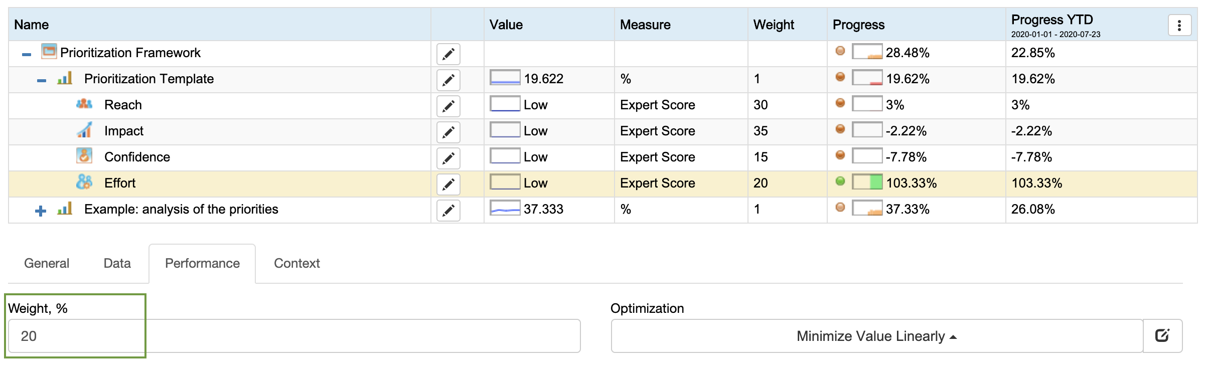
Positive vs. Negative Parameters
Some parameters are pre-configured as parameters with a positive impact on the final priority score (reach, impact, confidence), some as negative ones (Effort).
The optimization direction of the parameter can be changed on the Performance tab.
Measurement Units
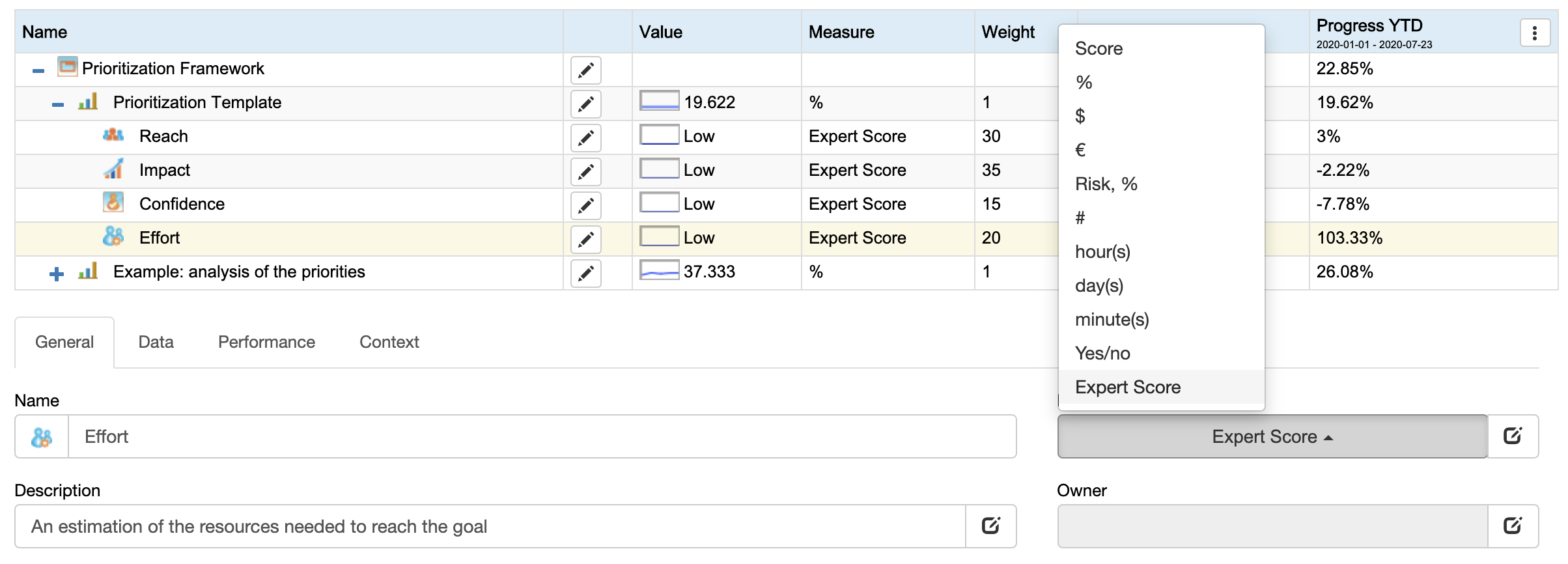
All parameters are pre-configured to use the “Expert Score” measure units that quantify the parameters on a nonlinear scale:
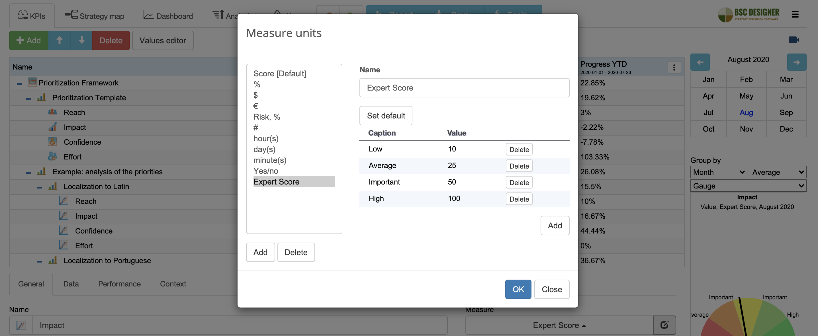
In this way, we can decide about the value of each parameter using a natural choice option:
If the suggested “Expert Score” measurement unit doesn’t fit the needs of your priority model, then you can configure different measurement units on the “General” tab:
Parameter Icon
To make the priority scorecard easier to read, we’ve adjusted icons for the parameters. You can change the icon by clicking on the icon next to the parameter name:
![]()
Parameter Description
A short name, like “Impact,” needs some more explanation. Use the “Description” field for this purpose.
An Example: Prioritization Model in Practice
To showcase the prioritization template in action, I’ll use two competing ideas:
- Localize product to Latin
- Localize product to Portuguese
Create a Copy of the Prioritization Model
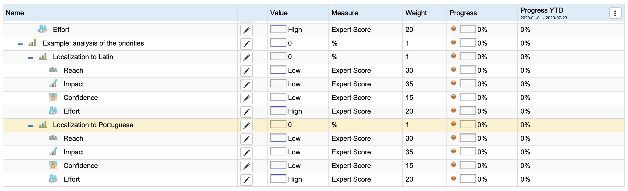
To organize things a little bit, let’s create a new group called “Example: analysis of the priorities.”

Now, we can copy and paste the prioritization template into the group.
I renamed the first copy to “Localization to Latin,” and the second group to “Localization to Portuguese.”
Score Competing Ideas
Now, it’s time to score two ideas according to the suggested parameters.
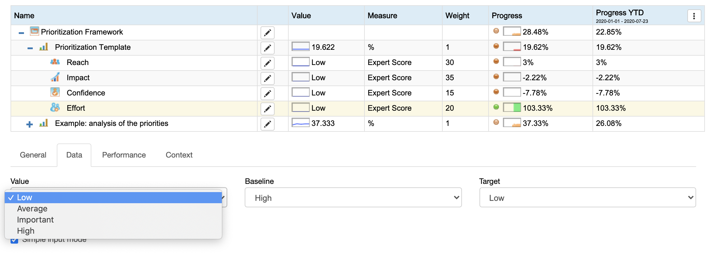
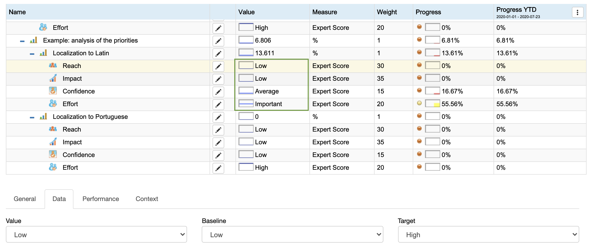
While Latin still has its application area, for our example, we consider that there are not many stakeholders interested in having Latin localization. Respectively, the score for the “Reach” (see the “Value” field) will be “Low”:
Let’s assign scores to the idea of localization to Portuguese:
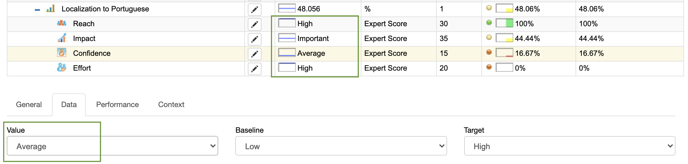
- On the one hand, the use of Portuguese by our target audience (the “Reach” parameter) is “High,” and the impact of the localization is supposed to be “Important.”
- On the other hand, we don’t know for sure if the product-market fit will be reached for the Portuguese-speaking market, so the confidence level is set to Average:
If you plan to use the results of the prioritization for strategic planning, I’d recommend to note down the ideas that stand behind the assigned score.
In BSC Designer, there is an “Initiatives” tool for this purpose.
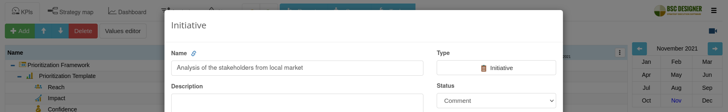
For example, for the “Confidence” parameter, we can create an initiative called “Analysis of the stakeholders from local market”, where we will review the website analytics data and analyze historical sales from local market:
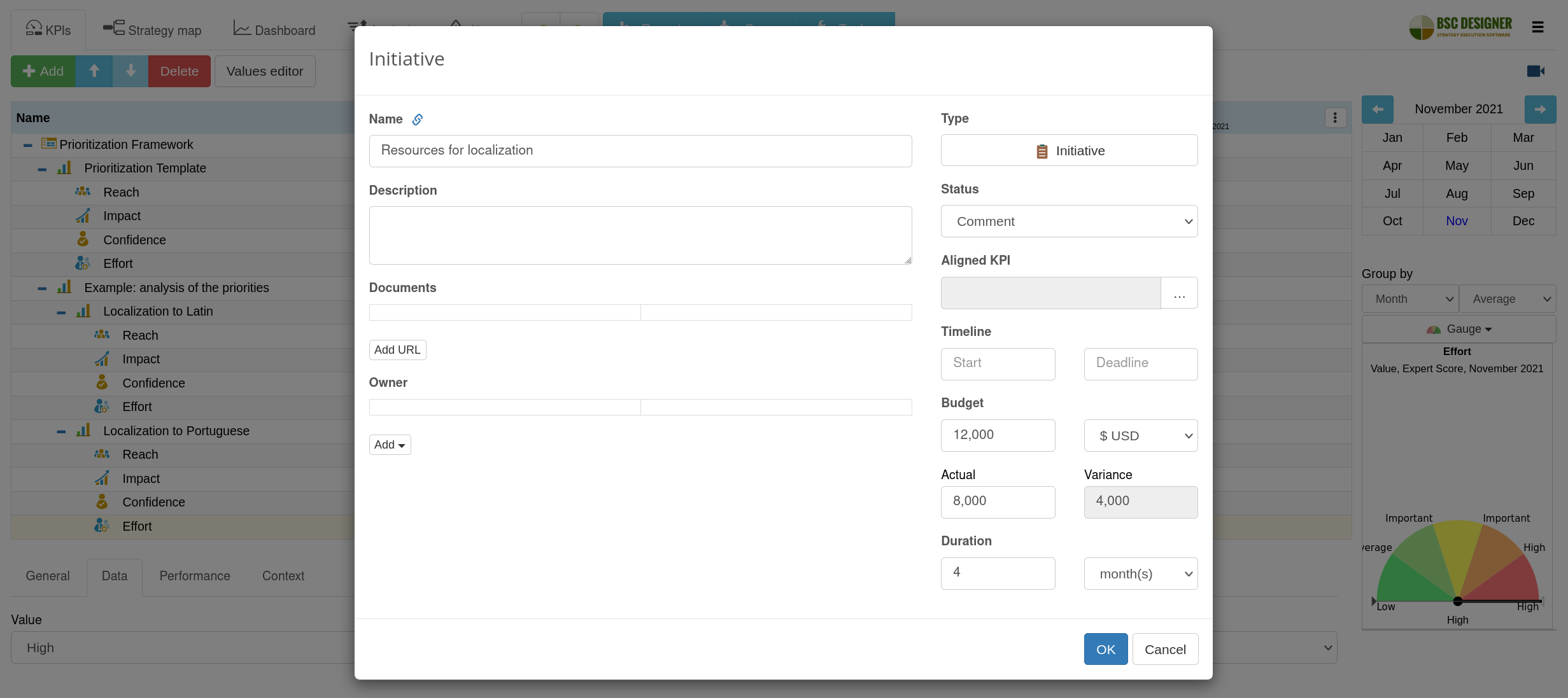
Another initiative can be the “Resources for localization” aligned with the “Efforts” parameter. This initiative can include the budget needed for the localization, as well as the estimated timeline.
The Priority Score Can Evolve
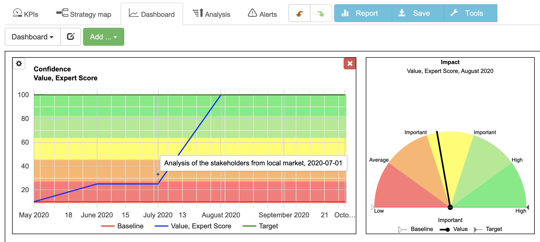
In BSC Designer, the priority scores are time-specific. Imagine that your team worked on the mentioned market analysis initiative and now is more confident about the expected product-market fit.
To reflect this in the software, we can pick another date in the internal calendar and update the value for the “Confidence” parameter.
If you plan to visualize the dynamic of priority score on a dashboard, you can track that the improvement in the priority score was due to the completion of the initiative:
Find the Ideas with Highest Priority
As long as we introduce new data, the software updates the priority scores for the ideas:
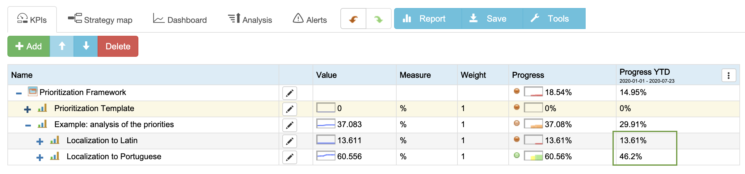
Latin, in this example, got the 15.5% priority score, while Portuguese got 59.17%. How does the software get this data? It normalizes parameters, calculates the priority of each parameter, and then uses the weights of the parameters to calculate the total priority score. We discussed calculation nuances in this article.
Having just two competing ideas, it’s clear which one got higher priority. When you have more ideas to compare, use the Analysis function. Sort the results by the priority score (performance) and focus the analysis on the containers only (the competing ideas):
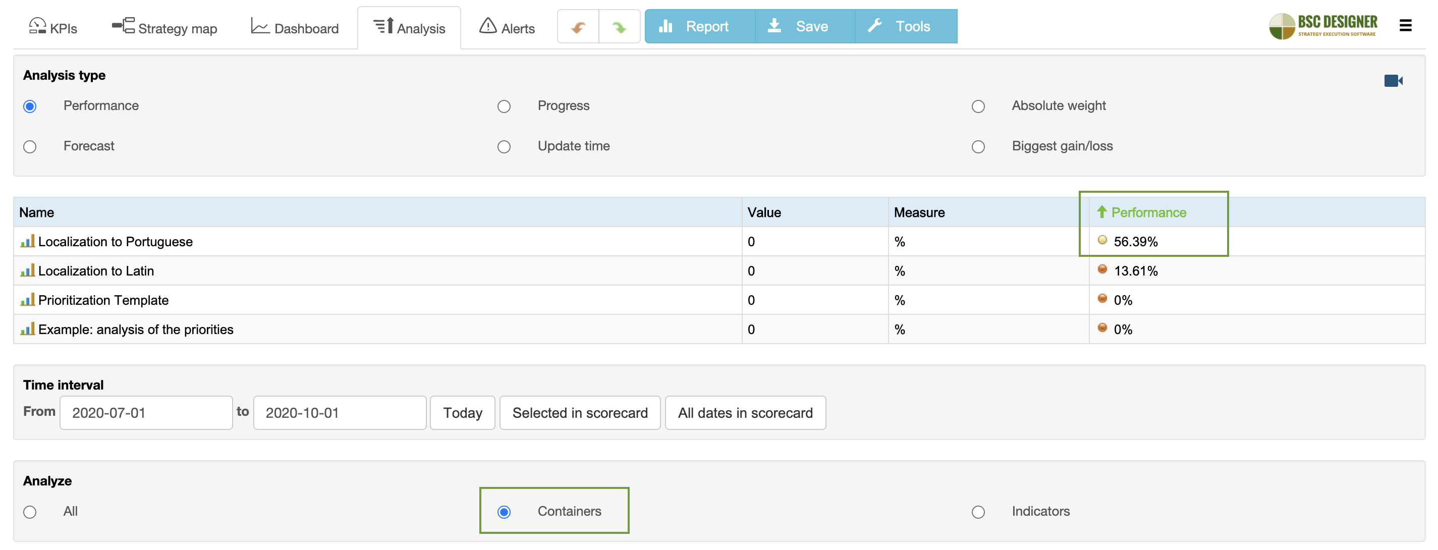
The list of items is now sorted by their priorities.
Conclusions
In this article, we discussed various prioritization frameworks: the basic ones based on a simple diagram or more complex that help to calculate a priority score. We also discussed how to use the prioritization template in practice.
A priority score might sound like a good tool. In general, it is, but there are always some crazy ideas that never get a sufficient priority score. Be sure your organization stays open to those ideas and passes them through proper innovative analysis.
What's next?- Follow our
 Strategy Implementation System to align stakeholders, strategic ambitions, and business frameworks into a comprehensive strategy.
 - Automate strategic planning with BSC Designer by organizing goals, initiatives, risks, and KPIs into scorecards.
More About Strategic Planning
![]() CEO | Author | Speaker
CEO | Author | Speaker
BSC Designer is strategy execution software that enhances strategy formulation and execution through tangible KPIs. Our proprietary strategy implementation system reflects our practical experience in the strategy domain.